FEATURES: Art Direction and Food Styling with Varied Themes
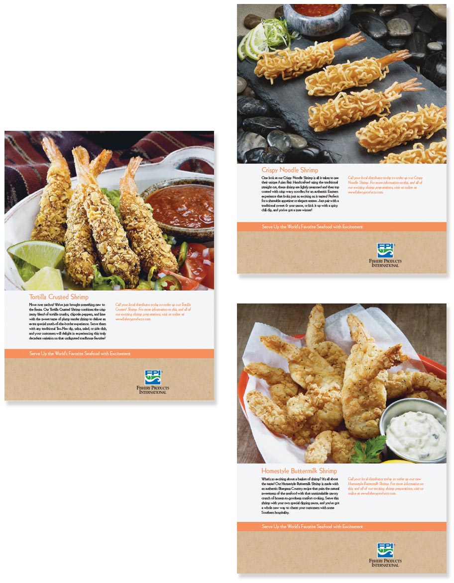
Just about every promotion needs supporting material in the form of printed or online collateral. It doesn't have to be elaborate or costly to produce. Actually, it should be simple, direct, and informative without the excessive sales pitch. In these samples, I let the image do most of the talking. In my quest for the perfect props, I hunted for items that would speak directly to the themes defined by the three distinct product flavor profiles. For the Crispy Asian Noodle Shrimp, I found a slab of slate, a stone sauce cup and river rocks to communicate a Japanese environment. Their deep charcoal color was also integral because they would provide great figure-ground contrast, which would lend to the Asian Aesthetic. The Tortilla Crusted Shrimp called for a more casual arrangement to provide a Mexican or South American ambience; I found a great handmade serving dish and a woven table runner to serve as the background. The presentation over a simple salad was important to preserve our relaxed South-of-the-Border theme. Lastly, I designed the Buttermilk Shrimp set to carry the look and feel of a classic East-Coast Fish Shack, the sort of place where you stand in line to select your food from a chalkboard menu, then carry (in a plastic basket) your freshly fried seafood to the nearest empty picnic table.
FEATURES: Art Direction and Food Styling with a Single Theme
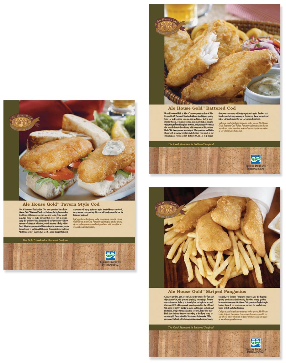
In contrast to the Shrimp Sell Sheets above, which were designed to highlight three diverse flavor profiles, the battered fish product line was made with one flavor profile to cover three different fish species. This called for a unified theme; one that might suggest that the three dishes were preparations of a single restaurant, perhaps an English- or Irish-style tavern tucked away on a cobblestone road of a seaside town or city. The recipe had beer flavoring in it. So I proposed the name, Ale House Gold™, and (after some time running it up and down the flag pole) the client grew to love it. I then set out to design the logo (on upper left of each sheet). I decided to pitch a "pen and ink" style of illustration that was popularized toward the end of the Enlightenment period (late 18th century), because this is a drawing style that can still be found on the hanging signs and plastered walls of the most old-timey of British taverns. The logo is deliberately and resolutely playful; it depicts a family crest between two jocular cods drinking beer. See a detail of the logo here.
FEATURES: Elevated Design and Art Direction for Industrial Products
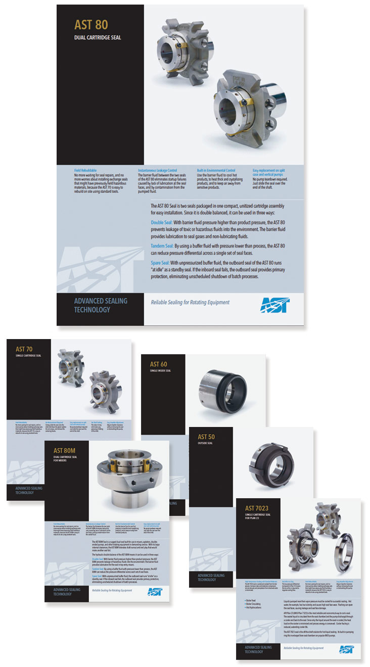
I've known young designers who would look at a Stainless Steel Pump Seal and express something less than excitement. They might even be tempted to mumble under their breath, "...don't we have a skateboard or soft drink project I can do instead?" Not me. I love this stuff. Any kind of tool, or widget, or apparatus, or doohickey is like a little toy to fiddle around with and turn into an action hero! This isn't hyperbole. Just ask my wife; I have thingamajigs all over the house. The client didn't offer me the opportunity to keep the AST 80 after the photo shoot (why would he?), but if he did, I would have gladly found a place for it on my display shelf. Just look at how the metal is cast and stamped, and machined, and drilled, and molded with U-shaped contours, and polished to a mirror finish, and fixed with brass bars and black screws. It's like a piece of artwork. As such, it deserves great photography and great design, not just to promote its intended use, but to highlight its exquisite particularity of form and quality of craftsmanship.
FEATURES: Clean and Precise Typography and Page Construction
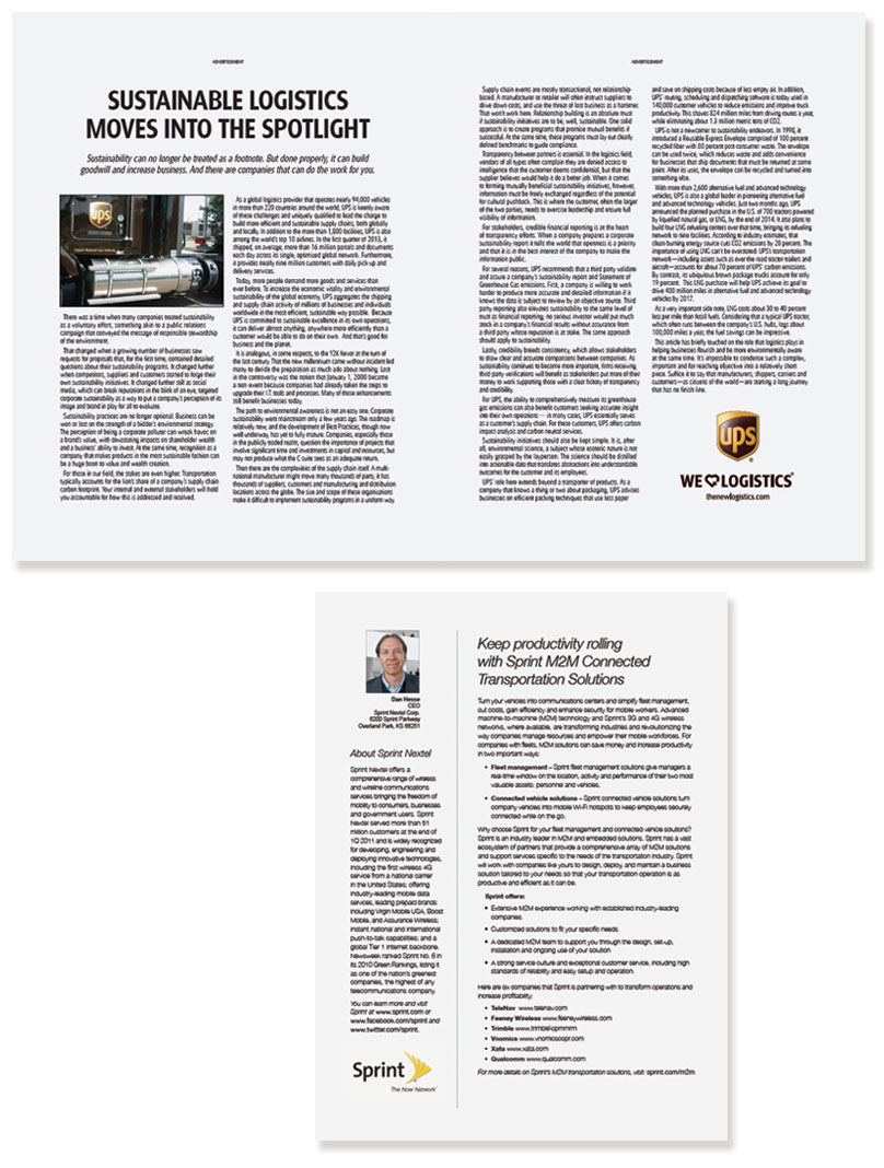
I built my career over the entire development of desktop publishing (beginning in the days when we actually used the term, "desktop publishing".) At my first design job out of college, I didn't have a workstation with a computer. I had a drawing table, a set of triangles, rulers, and circle templates. Across the room from my table sat a Compugraphic Phototypesetting Machine, and all the typography for our design department was coded and processed using that single machine, by yours truly, the official typesetter/illustrator/paste-up artist. (Note to Millennials: typesetting was still in use at the start of this millennium, so I'm not quite a relic yet.) My experience as a typesetter provided me with an early appreciation for well-crafted typography, with clean and precise line widths, leading, character spacing and kerning. In my opinion, even the simplest page layouts (and perhaps especially the simplest of page layouts) require excellent typographic skills to produce the most readable text. This art form is far from dead. I feel fortunate and privileged when companies, especially the larger organizations with a brand to uphold, call upon me to flex my typography and layout muscles from time to time.


