FEATURES: Strong Support for the Argument that Form Follows Function
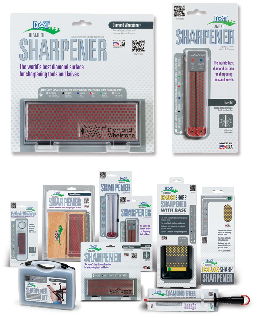
A hammer looks like a hammer. A knife looks like a knife. A chisel looks like a chisel. What does a sharpener look like? Good question, right? A sharpener can look like just about anything. It can look like a file. It can look like a block. It can look like a handle, a wedge, a slab, a disc, a wheel, a rod, a pair of crisscrossed rods, an electric razor, even an electric toaster…well, sort of. You get the point. When one is asked to create a package for a sharpener it's important to begin, first and foremost, with the understanding that it must clearly define the object displayed therein as a SHARPENER. What's more, you need to figure out a way for the package to accommodate all the different grit choices! Then, and only then, can one begin to actually design the box. In this packaging, I made the product display window serve double-duty as a grit chart. If the product displayed in the package is red, a corresponding red dot on the chart indicates that the grit is fine. If the product displayed is green, a green dot indicates extra-fine, etc. For double-sided products, I added an insert flap to emphasize each of the two grits, front and back. I selected white for the main background color of the package, because had I chosen any other color to dominate the package, it would have been confusing to the consumer. After all, a red box might imply that the product's grit was fine, a green box, extra-fine, etc. Plus, white stood out really nicely in hardware stores among all the yellow, black, orange, red and blue packages.
FEATURES: Strong Support for the Argument that Form Follows Function (part 2)
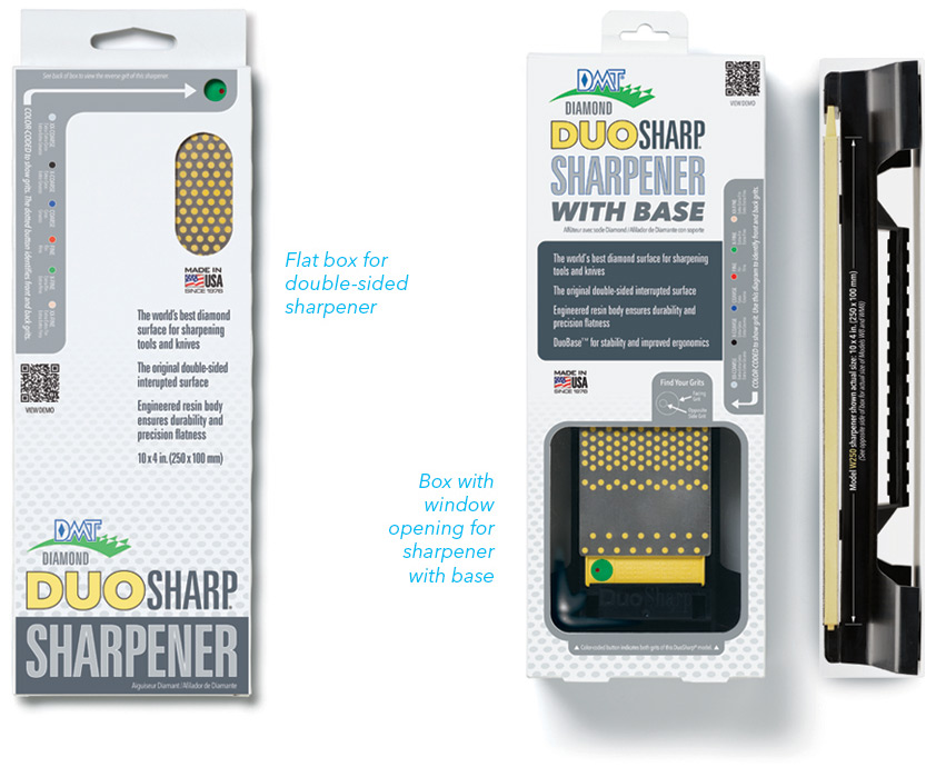
Here are two boxes made to accommodate two products: a slab-style double-sided sharpener, and the combination sharpener with base. Unlike the other sharpeners in the previous sample, which are color-coated, these products are always manufactured to be yellow because yellow is the brand color, NOT the grit designation. Not exactly intuitive, right? As a result, I had to design these boxes to display the grit designation in a different way. For the first one (far left), I used a circular cut-out within the grit chart and then branded the box with yellow text and a capsule-shaped opening that showed the yellow product inside. (This also allows the consumer to touch and feel the product surface.) I did the same on the back of the box so the consumer could tactically experience and understand the differences in coarseness. For the second box (shown in front and side view), I used a large display window and a graphic to "teach" the consumer how to read the grit designation on the product. This allowed the consumer to see the grit AND the exact size of the product as it sat in the base. The combo product came in two sizes; this sample shows the smaller of the two sharpeners to be sold with its base. (You can see all the empty space around the product, whereas the larger product, when packaged, occupies the entire window.) On the two side panels of the box, I displayed "actual size" photos of the product to show how each sharpener fits into the base. The side view shown here depicts the larger of the two products.
FEATURES: Rebranding for a Small Donut Shop Chain
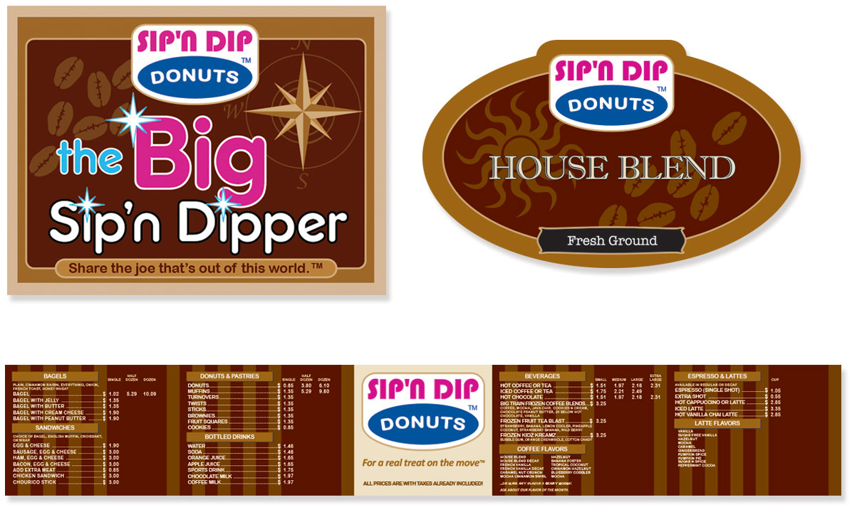
Small companies don't typically have generous marketing budgets, making brand promotions a challenge. It's especially difficult for all those small restaurant chains, like these coffee and donut shops, which have to compete with the mega-corporations. (You know the ones I'm talking about.) That's why I have a special fondness for this branding project. To help boost exposure for this small coastal New England chain, I came up with a very "mocha design" intended to get the taste buds going. For the menu boards, I incorporated some old-fashion vertical "ice cream parlor" stripes to give a nod to the classic New England family business AND to hint at all of those decedent coffee drinks that are more like sweet creamy deserts than your average morning cup of joe. For their packaging, I designed an oval coffee bag label and a coffee carton label. I proposed the name, the Big Sip'n Dipper, and gave the design a coastal/nautical feel. I also gave them a fitting tagline for the carton label, "Share the joe that's out of this world™". Lastly, I provided them a graphic standards document for the logo treatment so the branding would appear the same in all their marketing materials.


