FEATURES: A Method for Creating a Comfortable and Confident User Experience with Landing Pages
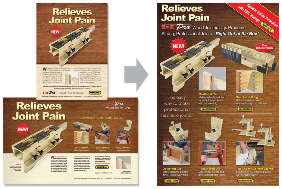
I could regurgitate a bunch of web research about Landing Pages, but that would be boring (and sounds kinda disgusting). So I'll just give my own perspective. A Landing Page is a promotional device that has to do its job of promoting. But it's also a communication that has to make a visitor feel comfortable and confident that he or she has arrived at the right place. In truth, that may be the most important thing it has to accomplish. Its namesake says it all. The objective here is to provide a landing. And, almost without exception, we all like to land comfortably, securely, and without complication. For this reason, I prefer to design Landing Pages that retain the tone, look and feel of the ad campaign. Sure, it's not necessary, but if the Landing Page reflects the message and appearance of the ads (far left), then it is virtually impossible for the viewer to arrive at the site with the slightest hint of surprise or reservation. That's the state of mind I need to make a confident purchase, so that's the one I seek for my viewers.
FEATURES: A Plan for Ensuring a Comfortable User Experience with Special Trade Show Promotions
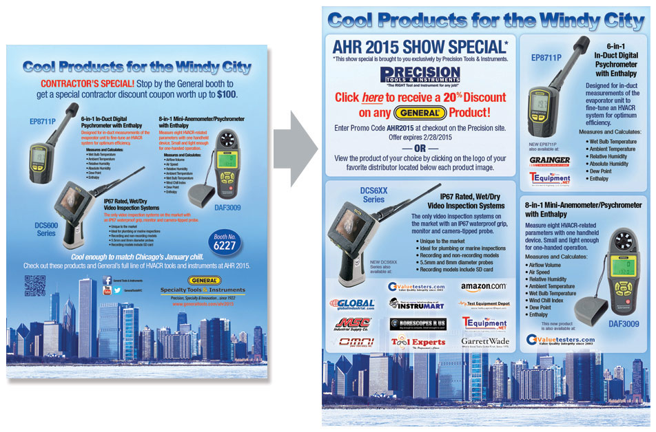
An experienced marketer will tell you that a trade show represents an excellent opportunity. That's true. A small business owner might say the trade show is an expensive opportunity. That's also true. So the goal is always to maximize the former without increasing the latter. To accomplish this, my preference is to think of each trade show as a 6-month program, rather than just a 3-day event in Chicago. It begins with early designs for select products and services, then pre-show advertising and promos, then show edition ads and a landing page. Through advanced planning, the graphical assets can be used and reused, leading to great savings in production; plus, the repetitive appearance of these assets increases recall, which will always prove advantageous at showtime. By the time prospects click from the ad to the Landing Page, they'll already be familiar and comfortable with the company's offering.
FEATURES: Landing Pages, Landing Pages, Landing Pages…
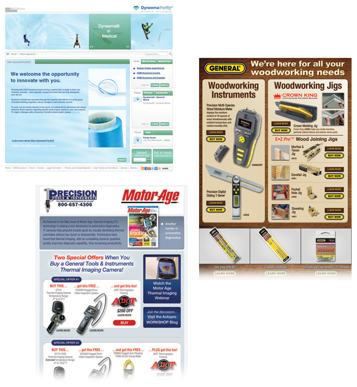
The internet is still young, but it's old enough to know what it wants. It wants all websites to be managed by Webmasters and Administrators, and it wants all its advertising to be handled by Advertising Professionals. The landing page is the very last bit of advertising that a user experiences before entering a website, so it's best executed by the ad designer. In the previous landing page sample I showed the importance I place on the thematic bond between ad and landing page. Now I want to share the more practical part of execution: straight-up production. The advertising design professional (that's me) produces ads, complete with all their associated assets (graphics, copy, layout files, etc.), while the landing page made to receive inquiries from hose ads is always best when it relates back to the ad in its tone, look, and feel. Therefore, the most potent, most efficient, and most cost-effective landing page design will always come from the original ad designer. (A self-serving statement? Yes…but a sensible one.)
FEATURES: Design with Visual Themes that Speak to Target Markets
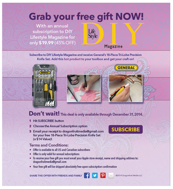
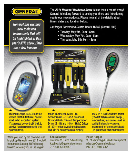
Sure, I sit on my butt all day making artwork, but that doesn't mean I can't be nimble. From the comfort of my swivel chair, I can at least be creatively nimble. Here are two emails that feature products from General Tools and Instruments. The first sample is an email for a DIY Magazine promotion, which I designed to speak to the Arts and Crafts Market. It's somewhat soft, pastel, and maybe even a little pretty. In contrast, the Hardware Show Promotion employs a high-contrast, rugged, hard-edged design to appeal to (the less aesthetically-minded) tool buyers. I chose these two samples for a side-by-side comparison because their demographics are so obviously different. In most instances the breakdown is not nearly this apparent. For this reason, I like to rely on good demographic reports, even when they reveal that the audience is truly a mixed bag with no dramatic tilt in age, gender, education, or income. You know the saying: "any information is good information." So I take whatever I can get.
FEATURES: Use of Whitespace and Succinct Messaging
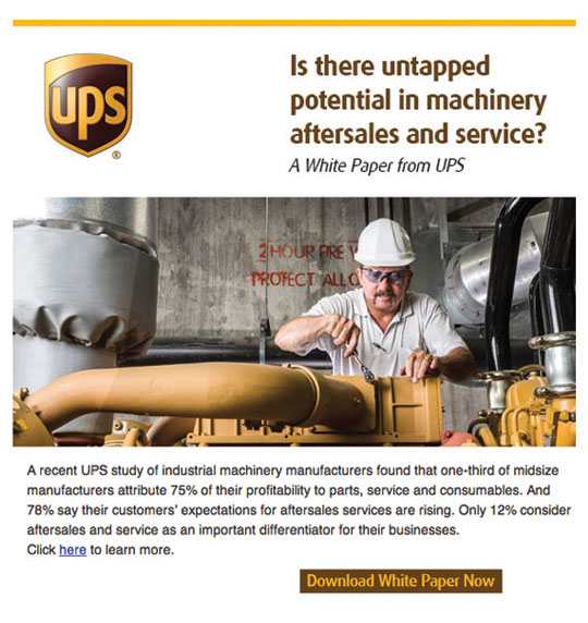
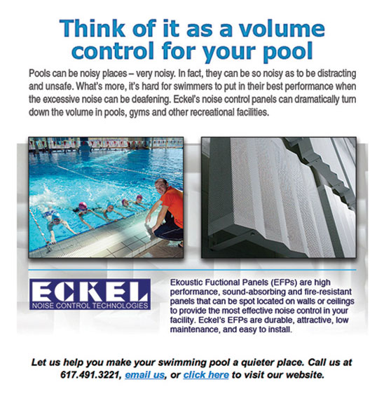
It's not hard to imagine that emails can be overlooked quite easily as they stream into a full mailbox. We've all experienced the all-too-common flood of random clutter, and our tendency, more often than not, is to delete, delete, delete. (Unless you're one of those who prefer to scroll them out of existence into the abyss of your ever-growing inbox.) The point is, there's not a lot of time (or tricks) to grab the readers attention before the thing disappears. For this reason, my favorite type of email is the sort targeted to a very specific crowd with a very specific offer. For example, the UPS email is confined to the Logistics Industry, and offers a white paper on machinery aftersales and service. Assuming, of course, that the mailing list is accurate and up-to-date, I can confidently say that there is absolutely no way for the recipient to mistake this email for spam. Furthermore, the language is direct and concise, so the offer is quick to grasp. The same holds true for the Eckel example; a facility manager that maintains a swimming pool will instantly comprehend the offer because it's clean, pertinent, and single-minded in its message.
FEATURES: Design with Consistent Visual Appearance Over Time
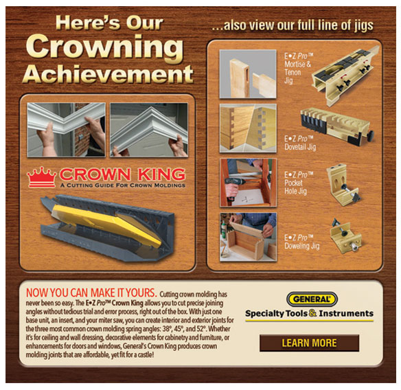
Building a brand takes persistence. Just about every marketer knows that. But understanding the need for persistence is one thing; practicing persistence is quiet a different story. In my years of experience, I've found that marketers have a tendency to tire of their campaigns too quickly, much more quickly than should be expected. I can't say I blame them; they have to see the same look and feel every day, day after day, over the course of many months. Every piece of marketing passes through their fingers, and naturally everything starts to look the same...stale, tired, depleted of its potency. While that might be true from the marketers perspective, it's hardly ever the case from the consumer's point of view. Here's an email campaign for a particular woodworking crowd that I executed over a span of three years, which proved very successful. I attribute that success to recall, and a feeling of familiarity, which produces in the audience a sense of confidence, the sense that this company and its products can be trusted, time after time, well into the future. Conversely, nothing makes a company seem more fly-by-night than a series of one-off product ads that share little to nothing in appearance.
FEATURES: Promotion of Urgency Using the Two Great Motivators
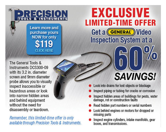
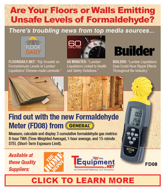
In our business, there always seems to be an exception to every rule. While for the most part, I stand firm with the battle cry for consistency, conformity and congruity in all marketing materials, there are occasions where these qualities have to take a back seat. In particular, there are times when market pressure, urgency, or alarm call for a bolder, brassier approach; one that dares to stand out at all costs. Damn the elegance. Damn the subtlety. Damn the high-minded principles of branding. This is a time for the straight dope, the startling announcement, the no-bones one-time offer! Here are two email examples, each offered to represent one of the two great motivators: fear and desire. The first features a limited introductory offer at 60% to give the audience a one-time chance to purchase a new video product, which they might otherwise consider a luxury item, a "nice-to-have" rather than a must-have.The second example seeks to quell the consumers fears by offering a product that can put their minds at ease concerning a very alarming and timely news report about dangerous Formaldehyde levels in wood products.

