FEATURES: Consistency across multiple ad sizes
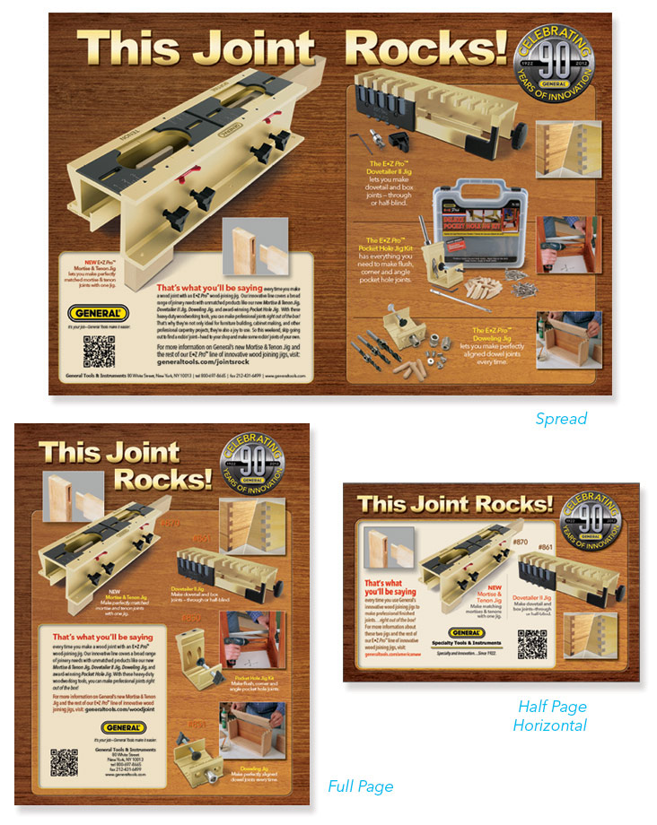
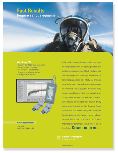
At some point in my creative career I came to realize that it wasn't good enough to create a strong ad concept. Ultimately that concept would have to be seen (and comprehended) throughout a variety of media—and in different ad sizes ranging from two-page spreads to small fractional ads. The variations can be dizzying. (And this not to mention web ads!) Fortunately, I would come to accept that this sort of editorial mayhem was inevitable, and therefore I just had one choice to make: develop disciplined design practices OR live my remaining days off-grid in the isolation of my woodland shed. My decision? Today I start every design with a set of minimum and maximum sizes for the various design elements: the copy box must be no larger than X, the font no smaller than Y, etc. Then I prioritize and manipulate these elements according to what I want the viewer to see first, then second, then third. This produces an order and sequence within each ad, and a continuity throughout all ad sizes. And the best part…I get to enjoy much better cell reception living in the city.
FEATURES: Sculptural Graphics Made from Processed Dry Foods
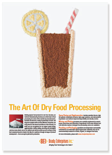
A co-manufacturer for big-brand food companies, BEI produces a wide range of dry food products, with a focus on delivering high-quality powdered goods by way of some very skillful and sophisticated production methods. For me, this refined process called to mind the process of art, which then lead me to think, "why not create a work of art from the 'medium' that the company produces?" After presenting the concept for approval, I went to the local market in search of dry foods, and not based on brand but on color and texture. I grabbed instant teas, coffees, pudding, and just about every powdered drink I could find. (At checkout the cashier must have thought I was a serious candidate for Type 2 Diabetes.) In studio, I used templates and adhesive spray to carefully fix a thin layer of powders, then piled on each color as would a Tibetan sand painter. At the photo shoot, I brought extra powder for the finish work, and lastly I retouched the final image in PS.
FEATURES: Small-space Vertical Marketing in the Tool Industry
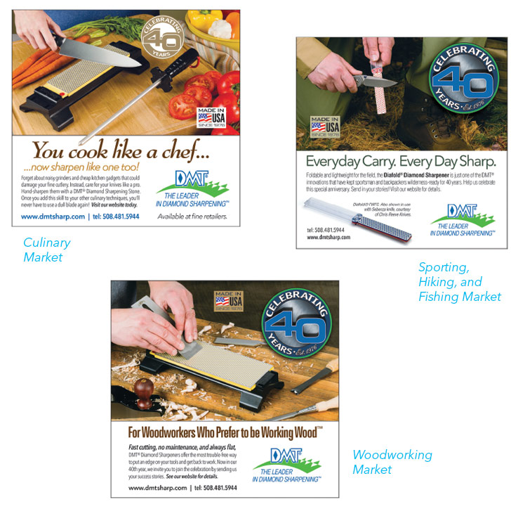
Though rare, there are certain products that occupy a surprising range of markets. Such is the case for a small subset of hand tools, namely sharpeners. As unlikely as it might be to find, for example, a socket set in a chef's kitchen, or an adjustable wrench in a hunter's pack; you will, in fact, find a sharpener in both places...and more. As a result, if one is to advertise sharpeners properly, one has to spread a marketing budget pretty thin to cover all their viable markets. For this reason, I streamlined most of my efforts toward the concept for each vertical market while I created a single layout template to satisfy the ad specs across all media. In short, since each ad would have different proportions required by the various publishers, I identified those with the narrowest, widest, tallest and shortest dimensions and used those to mark my clear area. Then, when any given ad material came due, I could just reset the crops and the ad would be good to go. This technique saves valuable time and money without having to resort to a watered-down, general-purpose ad in an attempt to cover more than one market.
FEATURES: Vertical Targeting of Multiple Products in a Single Ad
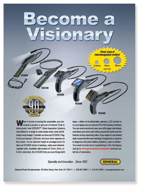
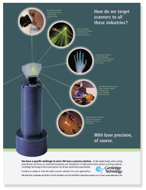
Sometimes a client hands over a box of products (or a download of product images) with the intent to feature all of them, with equal emphasis, in a single ad. In such a case, the first question that might come to mind is this: "I wonder if it's too late to become an organic farmer?" The second (more productive) question: "How can I represent these different products as a single thing, as one idea?" The answer usually comes down to one of two tried-n-true solutions: feature a thematic representation of the vertical market (e.g., the sports market theme); or create a unified visual of the product family (e.g., the "lightshow" of video scopes). When representing a vertical market, I find it best to keep the theme very simple because the grouping of products is likely to be visually distracting due to the varied sizes, shapes and colors of the items. In this case, I chose the iconic white-lined green grass to represent the ubiquitous outdoor sport, and a headline that was short and poignant. A different approach was needed to create the "product family" ad because the video scopes had to serve effectively across several vertical markets. For this reason, I kept the background neutral and produced an image of the products (each with equal emphasis) in a diagonal arrangement with their lights illuminated.
FEATURES: Experience with High-tech B-to-B Advertising and Marketing
In my "previous life" I owned and operated an advertising agency on Newbury Street in Boston, Pontes/Buckley Advertising. Ring any bells? No? I'm not surprised. We specialized in Advertising for Small-to-Mid-sized High-tech companies during the internet boom. So all our focus was dedicated to some very specialized, and very particular technology products and services. For those who remember the boom, it was filled with small innovative companies with all sorts of great tech, and it seemed that new companies and innovations were introduced every day. As technology specialists, this required us to learn new tech all the time, win the business, and then present our client's solutions to the market in a way that proved not just understandable but a necessary part of the technology infrastructure. This was no easy task. In fact, it was frustrating at times. On the plus side, it did force me to develop a keen ability to distill complicated ideas into clear and concise benefit messages. (If you want to see more samples of tech ads, just let me know. I have a Bajillion of them.)
FEATURES: Evocative Imagery in Small-space B-to-B Advertising
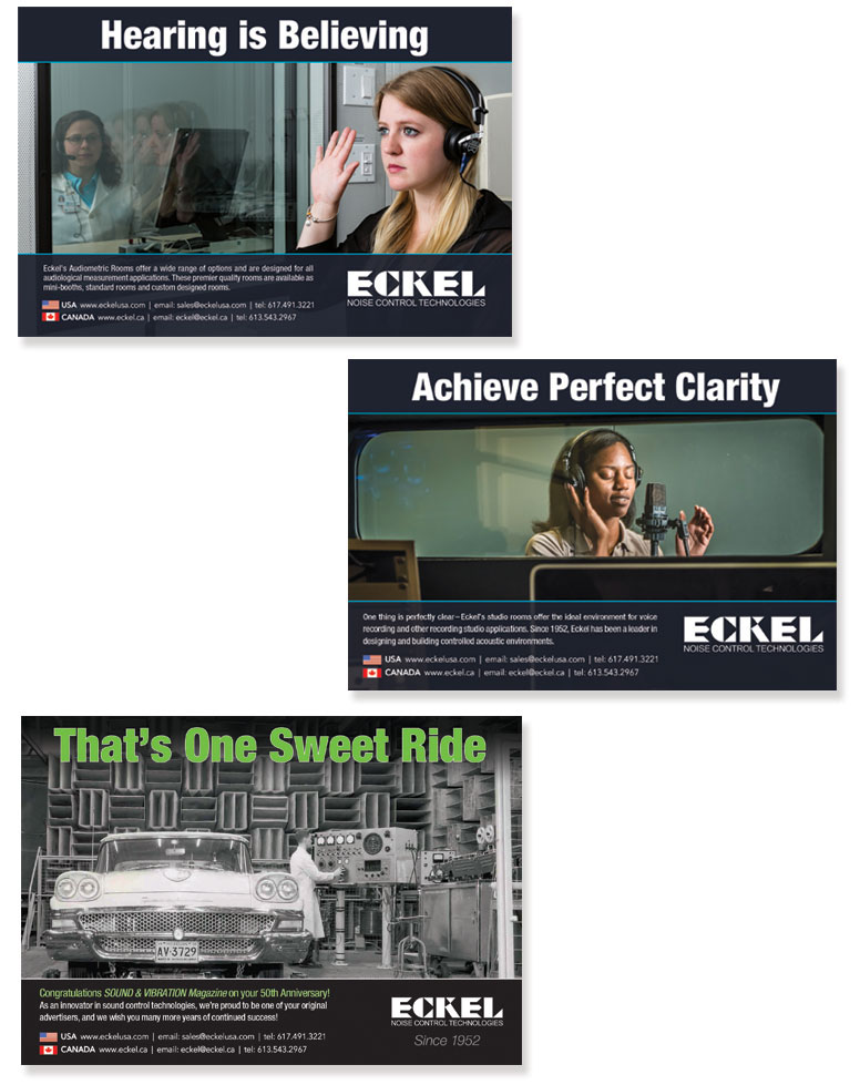
The image of a sound-control chamber can offer little in the way of visual appeal, and the space restrictions of a half-page ad don't help either. However, great photography can turn even the most austere looking products (and the smallest of ad spaces) into an evocative advertising campaign. In this series, I provided some off-site art direction to the photographer on location to produce images that captured the experience of using a sound-control room. I viewed the photos by email to save time and money, offering my feedback as needed. In studio, I color-corrected and retouched the pics to make the models "red-carpet-ready", then designed a layout that emphasized the notion of peering into the sound booth. The final image was compelling in the way it rendered the perspective of voyeur, the onlooker witnessing the action taking place inside the booth. The bottom example represents an extra placement made within the run of the regular campaign. This ad was simply used to congratulate the publication, Sound and Vibration Magazine, on their 50th anniversary. It provided us a great opportunity to promote the companies image, in particular its longstanding reputation. I utilized a historic photograph depicting a 50-year old example of the company's sound room for the auto industry, and combined that with a double entendre that served to introduce our words of congratulation. I made sure to include the sign-off, "Since 1952"...just for those with an eye for that sort of detail.
FEATURES: Special Design Techniques for Drawing Attention to the Product
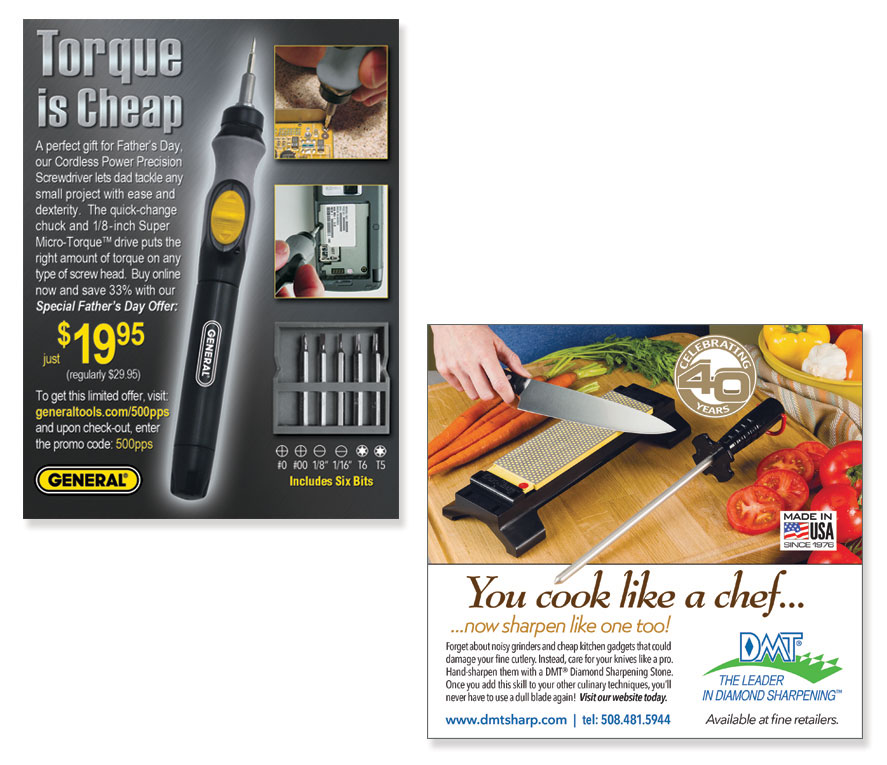
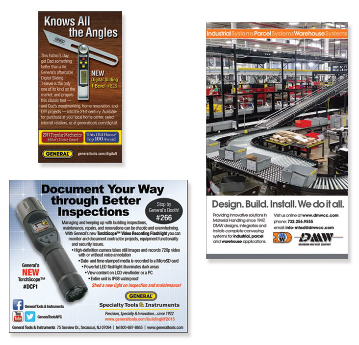
Without the luxury of print space, small ad placements can be difficult to make stand out, especially when they are positioned against a full page of contenders. This is particularly troublesome in the retail market where the placement price is high and the competitive noise is the highest. For this reason, I like to use some kind of technique, a visual trick or illusion, to draw the viewer's attention to my ad. Here are two examples. In the screwdriver ad, I used a 3-column layout but with the tool occupying the entirety of the center column. Then I tilted it to break the grid, creating a very noticeable diagonal…sort of like the Leaning Tower of Pisa standing out against an otherwise plumb cityscape. I further emphasized this effect with a dark background and a glow around the product. In the second example, I employed the classic "Z" pattern, which starts upper-left at the hand and along the knife blade, changes direction at the steel, and then again at the headline. More importantly, I used the tip of the sharpening steel to violate the text block. This draws attention to the product as it acts as an "arrow" leading to the word, You, in the headline. These minor effects can be very powerful, even though readers are rarely conscious of them.
FEATURES: Special Design Techniques for Drawing Attention to the Headline
Virtually every designer yearns for the opportunity to design that big high-visibility spread, or oversized brochure, or killer homepage. But for many of us, these big projects represent a fraction of our work. The truth is, I spend most of my time trying to get the most out of small-space ads, be they the online or print variety. With small ads, the very least you want to accomplish is to have the reader read your headline. That may be just enough to tell the story, or otherwise inspire further reading. For this reason, I like to make layouts with visual tricks in them, something to draw the viewer's attention to the first word of the headline. In the first example, I allow the product image to do all the work, placing it in such a way that it both underlines the headline and points directly to the first letter of it. Had I placed the product toward the bottom of the ad, or above the headline, I would lose the opportunity to achieve this sort of impact. The same holds true for the other two examples. In the General Tools ad, the flashlight illuminates the upper-left to draw the eye to the word, document. For DMW, I created a "Z" pattern and utilized the strong diagonal of the conveyor belt to draw the eye down toward the headline.
FEATURES: Targeted Messaging in Online Media
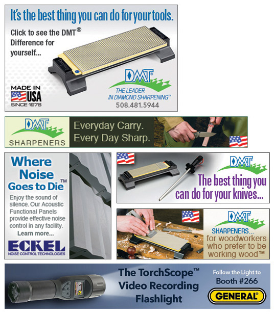
A leaderboard, banner or other small rectangle pops up with just about every click. That might be an exaggeration, but not much of one. The frequency with which we're bombarded with these things is staggering. So, as a creative professional, it's important to know how to make these little ads work. I'd love to say that all my online ads stand out from the rest of the clutter…like a bold object popping out from a 3D movie screen. But the truth is that there's not a whole lot of space to make "designer magic" happen. In the past, we've tried blinking text, flashy animations, and other gimmicks to grab the viewer's attention. Today, I've come to believe that simplicity works best. I try to limit the elements to just three: (1) a clear offer or message, (2) the relevant image and/or logo, and (3) some language that lets the reader know what to expect upon clicking. Of course, the nature and number of elements can vary based on the media outlet or portal, and sometimes rotating banners are needed. But my overarching mantra is always this: effective online ad design is best accomplished with the least of what is absolutely necessary.
FEATURES: Minimizing Clutter and Maximizing Visibility of Tiny Online Ads
In small ads, everything has the potential to create clutter, or distracting the viewer away from the message. As with banner ads, the first thing I do is decide which elements are absolutely necessary. Sometimes, a logo and a message is enough to do the job. More often than not, an image is needed to tie into an existing ad campaign, or otherwise show the product. In the case of the sharpener ads, it was important for me to use the word, sharpeners, somewhere in the ad since sharpeners are not easily identifiable by their form alone. They come in all sorts of shapes, sizes and colors, with no distinguishing contours that shout, "I am a sharpener." The exception is the sharpening steel used in the culinary market; it comes in only one form, a long rod with a guard and handle. As a result, I was able to omit the word, further minimizing the potential for clutter. To demonstrate the counterpoint, I have included the Eckel ad in the mix. In this ad it was necessary to include a bit of copy. The necessity is created by two unavoidable factors: (1) the product image and company name are not descriptive enough to infer, along with the headline, the given benefit; (2) the media outlet was not industry-specific, rather it served up general content to a broad audience.
FEATURES: Direct Mail…What's Direct Mail?
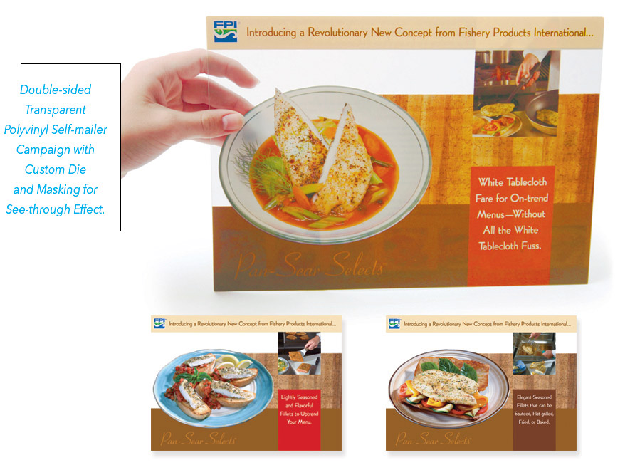
OK. Maybe that's an exaggeration. Direct Mail, like all types of snail-mail, may have fallen out of favor in recent years but it's not entirely forgotten. In fact, I think it's bound to experience a small comeback. Just think of how noticeable a piece of direct mail would be should one day you open the mailbox to find nothing but that lonely little mailer! (You'd probably read it from cover to cover.) Hyperbole aside, I do still have faith in Direct Mail as a marketing vehicle, and in fact I think it's underutilized right now. I've included this sample to show just one of the many interesting ways to grab a reader's attention, and it's one that doesn't have to be costly. Here I specified a transparent plastic so I could create a layout that would show clear through to the other side; in this way the consumer, upon grasping the mailer, would appear to be "serving up" his or her own delicious dish of the Pan-Sear product. This, I believe, is the closest thing to having put "the product in the hands" of the consumer, thereby reenforcing that they, too, could serve dishes like this.
FEATURES: Use of Illustration and Photography to Emphasize the Benefit Message
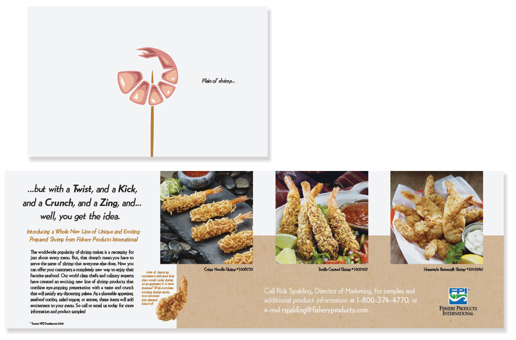
Now that we have digital printing available to us, gone are the days of minimum quantities. We all know what that means: we can limit our mailing lists to a small number of special recipients, and target them with a message that expressly pushes their mutual button. Here the audience is limited to managers of cafeterias/banquet halls. This is a group that must stretch a tight food budget to feed large crowds yet they are no less expected to serve up "gourmet" dishes. One way to impress diners is to serve shrimp, but grilled shrimp is a bit pedestrian, so the default is…you guessed it...shrimp cocktail (yawn). That's really all one needs to hear before the creative wheels start turning. For this concept, I illustrated a lonely little cocktail shrimp on a stark white background and employed a hard-edged drawing style along with a pale color palette to emphasize the banal simplicity of it. Then on the inside…Bam! …beautiful full-color preparation photos for the product reveal. (That's what I love about Direct Mail; it's like the surprise inside the box of cereal.) I DARE them to serve shrimp cocktail ever again!

