FEATURES: Dynamic Product Interface Design
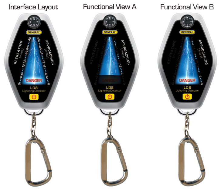
Sometimes a product design group has a chat with the VP of Marketing, then that VP then pulls you in, and, before you know it, you find yourself in a meeting about product interface design. Though I'm not a product designer by trade, that's exactly what happened; I was asked to develop an interface for a lightning detector that was visually "striking" and dynamic. This is my solution. On the left is the full layout of the interface; it shows all the text and graphics incorporated into the design, though not all of this info is ever visible at once. The next two screens to the right show how the interface works. Functional View A demonstrates that a storm is "approaching" (rather than retreating), therefore the lightning bolt and the right side of the meter becomes illuminated with blue arrows. It further shows the proximity, between 12 and 6 miles. (These distance indications get progressively illuminated, from 40 to 0 miles, as the storm moves closer.) Functional View B shows that the storm is upon us; a new proximity reading, 6 to 0 miles, is illuminated along with the word "danger" to alert the user. As the storm retreats (not shown), the left side of the meter (labeled "retreating") is exclusively illuminated; this continues in a gradual regressive manner, from 0 to 40 miles, until the storm is safely at a distance, with no arrows or data illuminated, and no portion of the lightning bolt visible.
FEATURES: Realistic Mock-ups Using In-store Photography and Composite Graphics
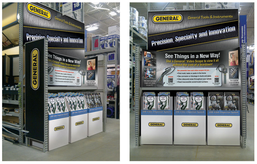
This is a technique that I've developed and used to help companies pitch product displays to retailers. It's a composite image that combines a photograph of an actual retail environment with layout graphics created in inDesign, illustrator and Photoshop. The layout graphics are manipulated within the photograph to take on a realistic appearance, enough to show the retailer the basic look and feel of the proposed in-store display. Here you can see that I've created two views of an endcap in order to show the graphics in a front view as well as the three-quarter view, which includes the large side panels that help to minimize the appearance of clutter as the consumer approaches the isle. The key to making these presentation mock-ups is to provide enough digital work to make the photo look reasonably convincing, but not so much work that the job incurs undue imaging costs. All it takes is a smart phone, a local store, and the right software…and…well…I suppose a couple decades of digital imaging experience is also helpful.
FEATURES: Wearable Woven Textile Designs to Elevate the Quality of Trade Show Schwag
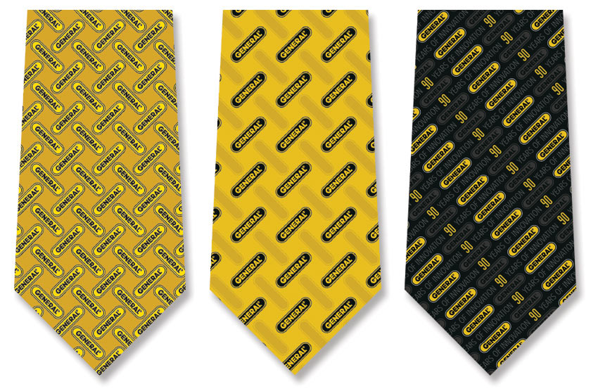
Marketing schwag is, by and large, tacky. Am I right? After all, isn't that the point of it all, to be a lovable eyesore, an attention-grabber, or at least something "loud enough" to be remembered. Sometimes this takes the form of a fun graphic, a clever phrase, a surprising juxtaposition, or maybe all three! It's OK to be a little "out there" when it comes to giveaways. Well…it's OK with one exception: ties. There's something about ties that command more respect than can be delivered by a big bright icon or imposing statement in bold font. It's just too much, something exclusively for a clown to wear. Don't get me wrong; I love ties with images on them. I like the little fish patterns, dog bones, and horses. I can even tolerate the nerdy and campy designs, like computer boards, Christmas lights, piano keys, flags, etc, but only as they appear at special occasions or parties. In my view, there are only the rarest of occasions that call for such a tie in the course of marketing a product or service. So, when General Tools requested that I design a tie with their 90-year badge on it, I offered a slightly different tact. My opinion is that the act of outfitting your sales team in matching ties is statement enough that you must be celebrating something, and the presence of signs, badges, and logos featuring "90 years in business" all over the trade show booth is certainly sufficient to explain exactly what it is you are celebrating. As such, my solution was to create a woven textile, rather than a printed tie. In this way, from a distance the graphics could take on the (uptown) appearance of a typical tie pattern, while they would no less be perfectly readable to those who entered the booth. However it might have been received on the show floor, I think the sales team certainly appreciated what my designs offered in preservation of their dignity.
FEATURES: T-shirt and Woven Jersey Designs for Employees and Customers
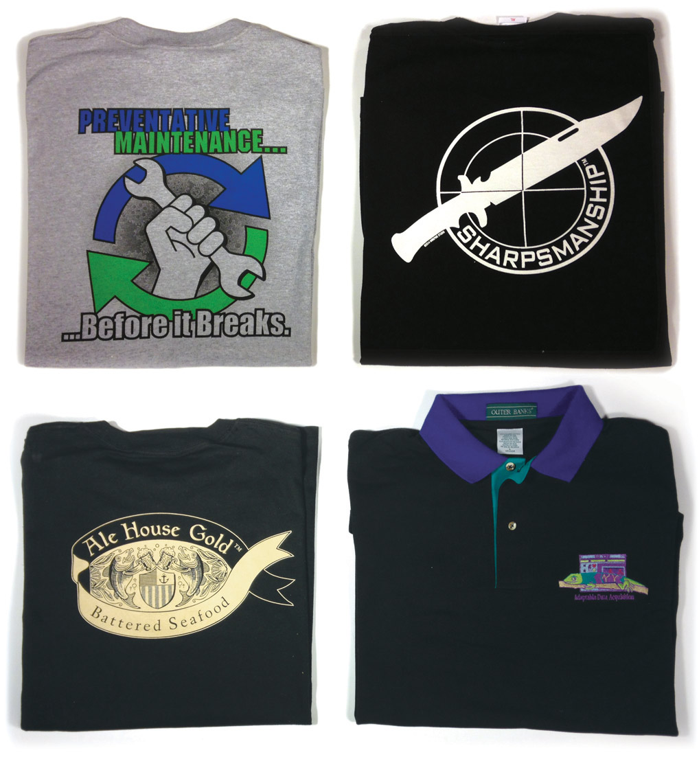
If I had a dollar for every t-shirt I designed throughout my career...well...I'd have a lot of dollars. Unfortunately, I don't sell these shirts; I just design 'em. (NOTE: There is one exception. The black shirt with a knife on it is, in fact, for sale. This is a trademark of the WirePike Studio that was designed for knife enthusiasts, which I offer for sale on a custom order basis. If you are a knife enthusiast and you'd like to place an order, please fill in your contact information at the bottom of this page. Prices vary based on quantity and material suppliers.) Now that I have that shameless sales pitch out of the way, allow me to get back to the subject at hand: design. Oh, who am I kidding? This portfolio sample was never about design; I just included it to sell these killer knife shirts! So, what do you think? You wanna buy a cool knife shirt? What are you waiting for? Send in your request today!


