FEATURES: Thorough use of illustration in trade show display design
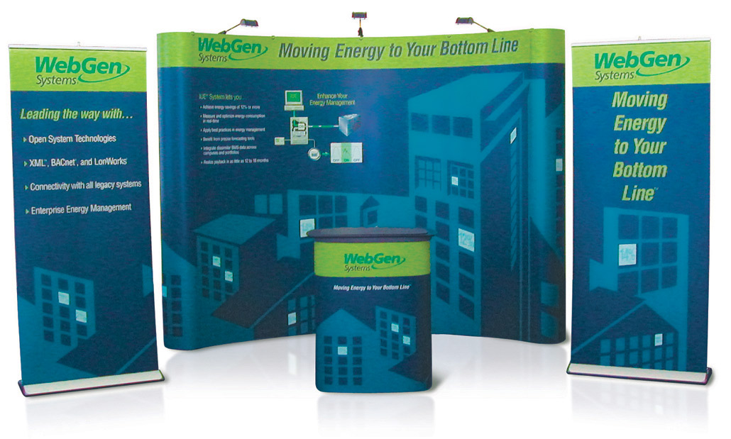
The first time this booth design appeared at a show—one of the largest annual building events in the U.S.—the company won a "Best New Product in Show" award. Such an accolade would seem much less of an accomplishment for me, the booth designer, and more appropriately one to be celebrated among the product designers and engineers. There can be no doubt that's true, and yet I am no less proud of this honor. My pride comes from the fact that the company had been exhibiting that very same product several years prior. It wasn't until this year—the one in which the new booth arrived to speak up for the product—that the company was finally noticed for its innovation. Coincidence? Maybe, but I don't think so. This was an instance where the company had an amazing and innovative idea to control energy consumption using Artificial Intelligence but struggled immensely in their attempts to communicate it to building supervisors. In the end, my solution was to rely heavily on simple but informative illustrations. (Don't miss the full story about this unique case study. Read more about WebGen on the illustration page.)
FEATURES: Innovative use of Photography for trade show display
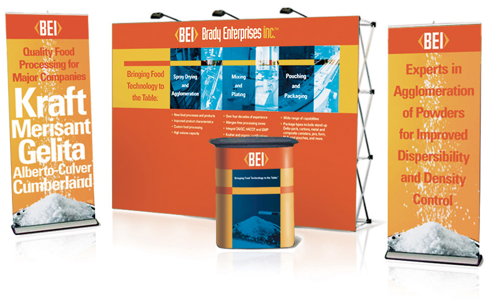
Have you ever gone "behind the curtain" of a place to find it didn't live up to your expectations. Such was the case when I toured this food manufacturing facility. It wasn't that I found the place unclean; in fact I didn't find it the least bit suspect in that regard. It was more like the experience a child might have upon gaining access behind one of those "employees only" doors at Disney World®. All the "magic" was instantly stripped down to the pragmatic operation of it. In short, it wasn't as splendid and glittering as I had hoped. The truth is that most of the building never comes in contact with the food, so all the sparkling, shiny stainless steel parts we associate with food handling are limited to that which comes in contact with the food. I was crestfallen. I stood there gazing around this dreary space thinking, "how on earth am I going to make this catacomb look good in a photo?" Here's my solution. We took full color pictures of the space, complete with all the exposed beams, ugly catwalks, and marred floors. Then I masked rectangles around the shiniest stainless parts and converted the unmasked areas to a clean steely-blue duotone. The final effect delivered that feel of a sparkling clean-facility—the one I had originally envisioned (in my wide-eyed naiveté) from the start. Hmm…come to think of it…by creating this design, I'm now guilty of furthering the fantasy about the ultra-sparkling food factory. Oh well, once again perception wins over reality.
FEATURES: Demographically Targeted Design for the Food Services Industry
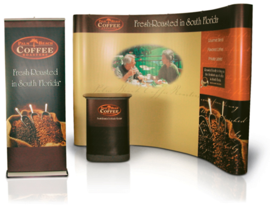
I've included this design because I like the overall look in combination with the compact, simple booth construction. It's minimalist yet complete. And there's something of even greater interest that I like about it, a kind of ironic twist. As it turns out, the strategy and concept offer no real opportunity for me to tout any special expertise. After all, who WOULDN'T have come up with this idea? Here I depict a beautiful image of fresh-roasted coffee beans along with a photo of an attractive elderly couple enjoying a lovely brunch among the orange blossoms in a balcony overlooking a golf course. Why? Well…uh…the company provided a fresh-roasted coffee service to high-end retirement communities in Florida. Yep. No real stroke of genius to see here...just connecting the dots. I suppose that and a cup of coffee should earn me...well...a cup of coffee.
FEATURES: Readable design with a versatile image area
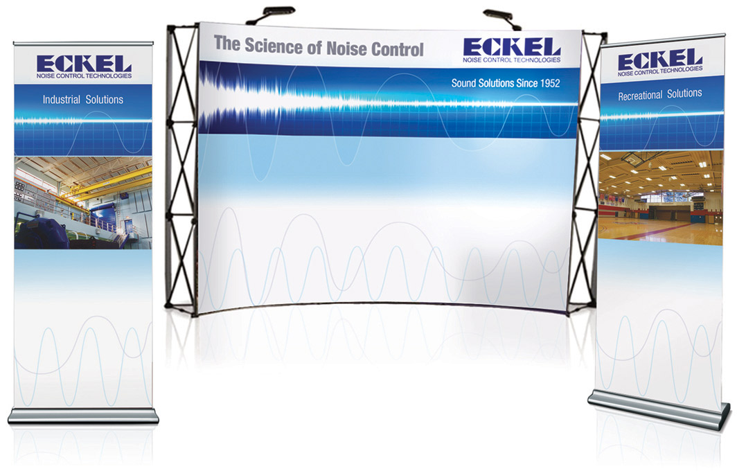
I never really thought about this before, but there are a lot of places with terrible acoustics. We've all been to the occasional noisy restaurant. Most of us have been to an echoey basketball game. But there are so many other places that need acoustic improvement, like indoor pools, libraries, meeting halls, temples, churches, auditoriums, manufacturing facilities, processing plants…the list goes on and on. For this reason, any company that provides sound control solutions would be well advised to seek out a graphic designer with a few tricks for extending ad coverage across multiple unrelated markets. And whatever trick one should choose to employ, the end game is to convey a crystal-clear message within a versatile design template. Here I developed a clean and concise "backdrop" upon which to deliver tactical messages. In this instance, the company could elect to display product samples in front of it, or adhere the messages to it. The pull-up banners are also available to feature specific markets for the various trade shows throughout the year. So the sky's the limit…the limit…limit…limit...
FEATURES: Vertical Targeting for the Culinary Industry
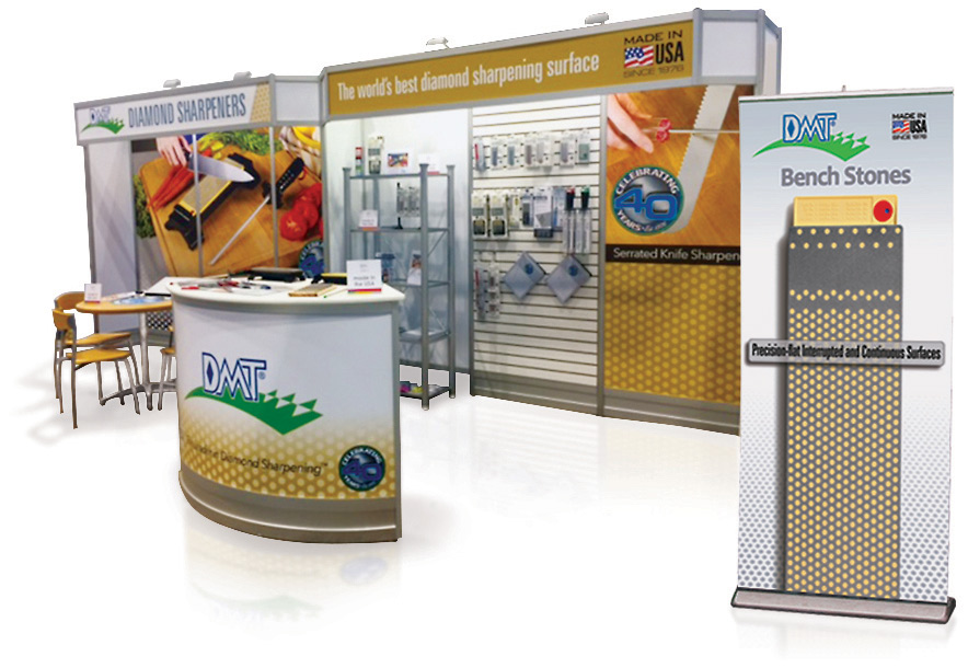
Housewares shows are very different than other industry shows. They require a certain finesse; the kind that results in an easy, comfortable and homey look and feel. Everything has to provide the sense that the products are familiar, manageable and foolproof. (You've seen the infomercials.) So here's the snag; sharpening stones aren't so familiar to the average cook, and they're certainly not foolproof. It takes some amount of practice, some minimum skill level, to properly sharpen a blade with a stone. So, rather than using one of our hardware show banners (pictured front right), I designed a large backdrop of a cutting board with a sharpening steel presented front and center; and behind that I represented the bench stone in use. The sharpening steel, along with the fresh-cut vegetables, provided the much-needed familiarity and coziness of the home kitchen. I reenforced this image with a second panel to the right of the product display, which featured a product that mimics the familiar look of a sharpening steel.
FEATURES: Multi-sided Kiosk Design with Hands-on Product Display
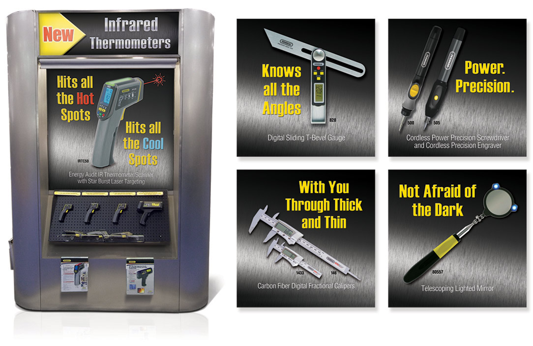
It's not too difficult to manage product presentations in a small booth; there's usually just one tabletop between you and every passerby. It's quite a different story when there's a large area with multiple product displays spread throughout the floor. In the latter case, the display has to do most of the talking because there's no guarantee that the representative will have a chance to speak with every interested visitor. Here's a solution I designed for General Tools to address this concern. Each kiosk had three sides, so we produced a single header and poster for each product category on display. I designed each poster to feature a single statement that would highlight the principle benefit delivered by that product category. The featured panel shows the infrared thermometer with its main benefit, "Hits all the hot spots; hits all the cool spots." Below, visitors have the opportunity to handle the products, or collect and browse the spec sheets. I've included 4 other poster layouts to the right, just to demonstrate the concept more completely. This method, if done properly, provides for a comfortable and informative show experience. (It also works great for touchscreen kiosks.)
FEATURES: Prudent Planning for Versatility and Cost-Effective Production
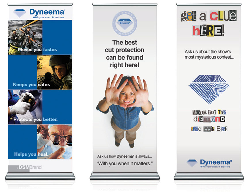
There are about a half-dozen essentials that make up an effective trade show booth design. I'm not going to list them here because there are so many other websites that provide those fundamentals. Instead, I offer this page to show the 3 most effective uses of portable trade show displays. Here are 3 designs I created for a company that produces high-strength synthetic fiber, the kind used to make bulletproof vests. (From left to right) The first type of display is a kind of general product overview. It simply provides visitors a snapshot of the various uses and benefits of the product. The second display is of the sort that features a new or special offer. This type of display allows the company to put a new or popular product (in this case cut-resistant gloves) near a prominent traffic area. The third example is also a very tactical (and yet underused) type of display: the trade show game. Trade show games provide the potential to be the "talk of the show" by giving visitors an interesting, informative, or fun way to earn prizes and giveaways. Naturally, people like the free stuff they get at these events, but the more memorable experiences happen when those people are engaged and informed, especially when they manage to get a laugh or two.
FEATURES: Product Display Header Design for Retail Outdoor Sports
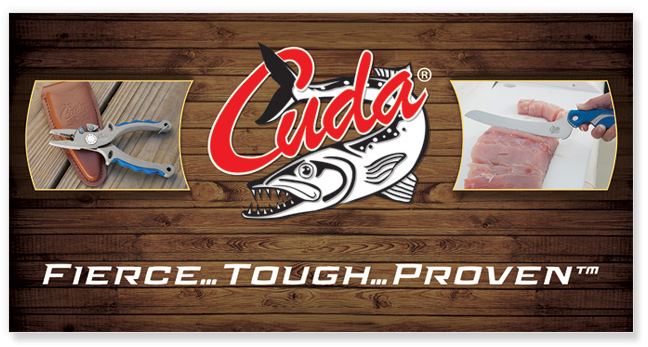
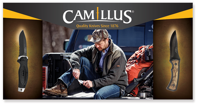
One time I went fishing with my cousin and, upon casting, snagged him with my lure. Good times...good times. I would've had much better success that day had my lure spent more time in the water, but I didn't generally worry too much about how many fish I caught, as long as I was fishing. You get the idea. The point is I love to fish, even when I only manage to catch my cousin. In fact, I'm a big fan of outdoor sports in general. Well, except for hunting, I never really developed a desire to shoot things. (I think my cousin is grateful for that.) Anyway, here are two outdoor sports displays that are designed to sit above a rack of products in a retail or trade show environment. I find these graphics very enjoyable to design. The process is very natural, almost automatic, because the main objective here is simply to be loyal to the brand image and inspire the sportsman to purchase whatever is on display. Plus, what's not to love about some great outdoor gear?
FEATURES: In-store Poster and Display Design for Special Promotions
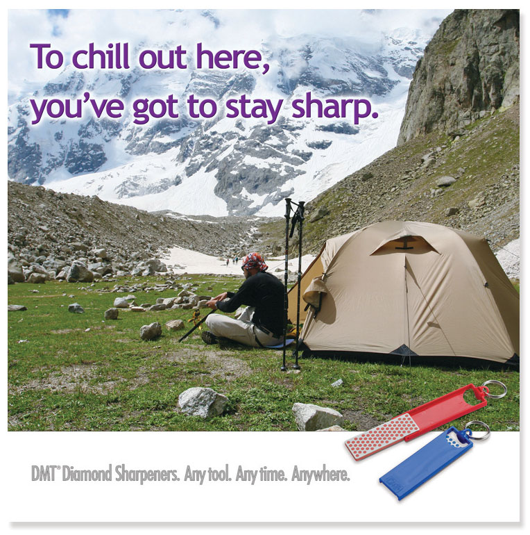
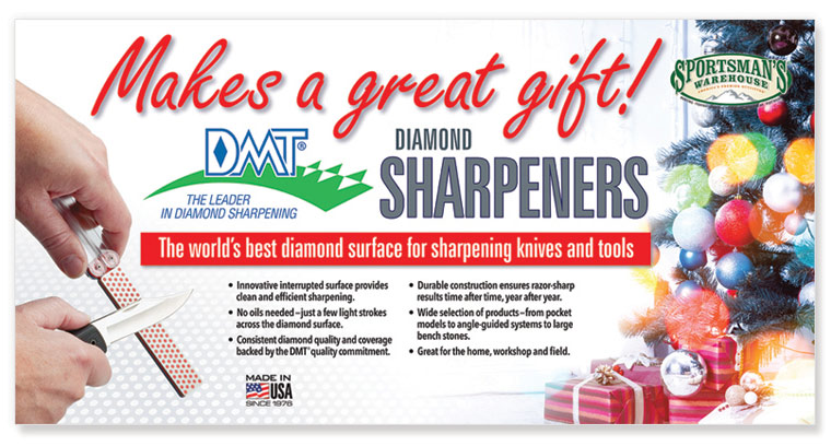
In the retail world, there are many occasions that pop up, which require a special promotion. Often this happens around the holidays, but it can actually happen any time, without warning. For those in the retail business, you know exactly what I mean! These circumstances usually call for some stock photography. Whenever I search for stock, I find myself in a time warp, because every photo seems to have at least one thing that's not quite right about it. The obsession to find the optimal image is an unquenchable urge, an unscratchable itch, that takes effort. When I finally come across the right one, the skies open up and life is good again. Here are two examples that show a successful use of stock. In the first, a sole climber sits at the base of a chilly mountain, seemingly awaiting tomorrow's big climb. There's a suggested vulnerability, but his posture is relaxed. His arms are positioned such that he might be executing a casual task (like sharpening), or examining his gear as he contemplates the day ahead. The second sample depicts the requested (i.e., mandatory) holiday (i.e., Christmas) display. It's always tricky to find the right holiday image because, almost invariably, the client will instruct that "it has to say Christmas without being too Christmas-y". I still don't know exactly what that means, but I usually interpret the statement to be a request for something subtle, like white candles on a snowy windowsill. Not this time, however, because the client wanted color, the sort of color that works magic in the Midwestern States. You know, Christmas colors. I found this image with a lot of lens flair that was shaped in a way that worked nicely across from the product demo image. It certainly "says Christmas" while the client found it "not too Christmas-y", so…success!
FEATURES: In-store Display Design that Communicates Detailed Information to the Consumer
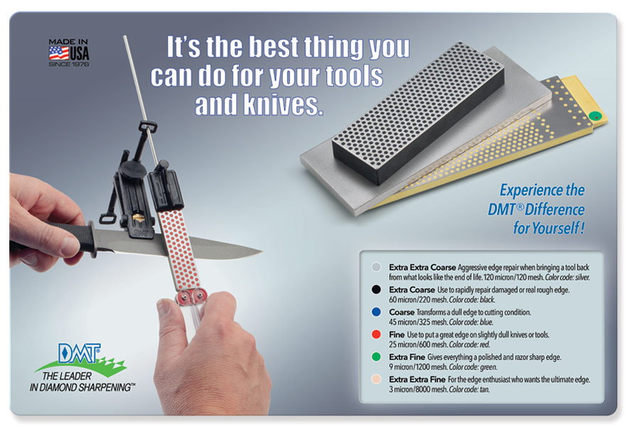
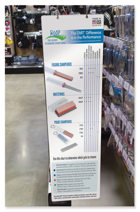
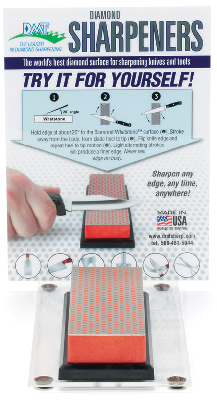
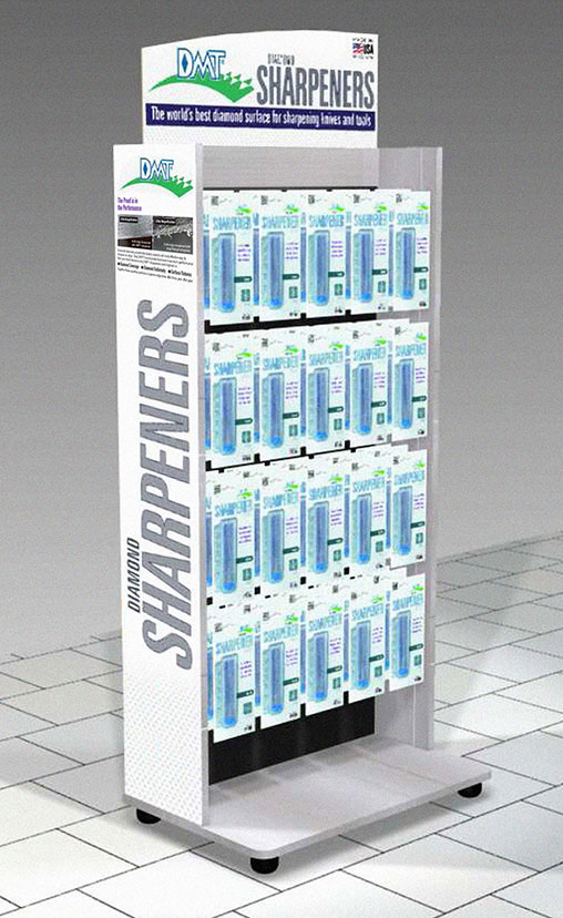
Hanging gizmos, protruding thingamajigs, countertop whatchamacallits, and standing doohickeys are all a part of the retail marketplace. So you've got to be prepared to make them all work in any sort of environment. The trick with these marketing devices is that they often have to communicate a substantial amount of information without overloading the consumer with extraneous design elements. The Counter Pad (top) and Aisle Violator were fairly simple; they only had to explain the product types and grits to be used on various tools. However, the Demo Display was an entirely different story. It had to teach the consumer how to use a sharpener while also showing the different tools that might be sharpened. This created an excessive amount of clutter on a tiny footprint, a poly card, which slipped into a small acrylic product display. My solution to mitigate that unsightly sense of clutter was to design the photo such that it looked like a mirror image of the actual demo, thereby connecting the 2D world of the poly card to the outside space of our real world. Although I would have still preferred the option to remove some of the elements on the card, sometimes a little innovation can do just as well to produce a viable solution.

