
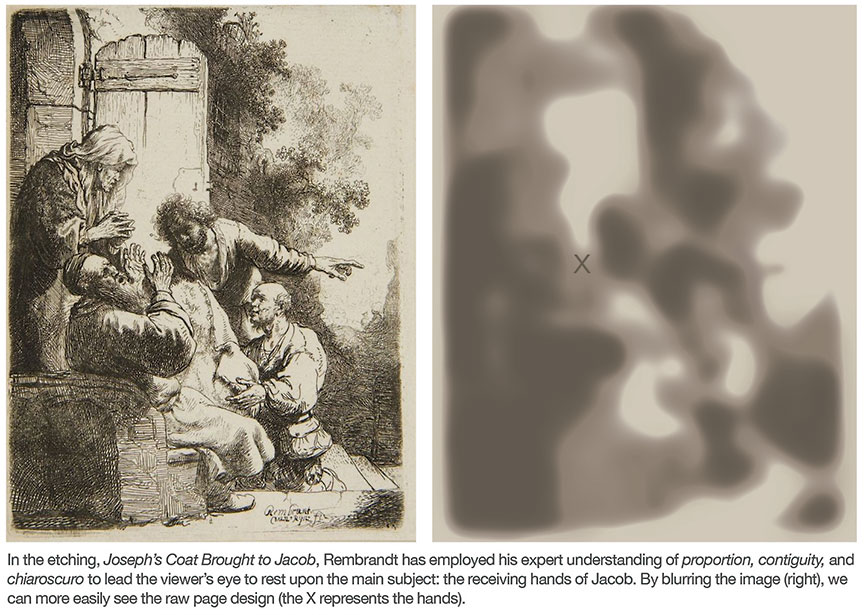
In a previous blog, I outlined three areas of focus that might be useful for developing artists and graphic designers to improve their practice: Proportion, Contiguity, and Chiaroscuro. This article is offered to further explain the meaning of Contiguity, and in particular, to help artists identify occurrences of this “illusion” so they may be better equipped to utilize it in their work.
First, let’s start with the basic definition of Contiguity so there will be no misunderstanding of the term as intended here. In general terms, it is the state of things that are connected, close in proximity, or continuous in appearance. One of the most common uses of the word, as many are likely to recognize, appears in the phrase, the contiguous United States of America. This, of course, refers to the whole of the United States with the exception of Alaska and Hawaii, because those two states do not touch any other states, and therefore are NOT contiguous with the remaining 48 States. In this usage, we are referring to the continuous nature of our State borders, the edges or boundaries shared in an unbroken manner across the country. Each State takes on its own shape and each edge of that shape defines some part of an adjacent State’s shape. For anyone who wants to get a grasp of the general meaning of contiguous objects, this is an excellent example. However, this is not the sort of contiguity to which I am referring in this article because it deals only with shared edges and continuous lines. Conversely, the sort of Contiguity I will be talking about has to do with broken lines.
For a visual demonstration, I’ve created a two-part graphic that will illustrate the full definition of Contiguity…in all it’s forms. I call it THE CONTIGUITY OF FOUR TRIANGLES. Here is part I:

PART I (above) employs a simple “stack” of triangles to express the most common definition of Contiguity. Here you can see that, just as it occurs in the States, the top three triangles (gray, blue, gray) are positioned in a manner that can be described as contiguous because each one shares some portion of an edge with an adjacent triangle. The blue triangle may no longer appear like a proper triangle due to the overlapping gray one, but it’s no less contiguous; in fact it shares more than one edge with it’s gray neighbor to the left by way of its more complex form, like Texas as it abuts Oklahoma. In contrast, the bottom blue triangle is NOT contiguous; it’s like Alaska or Hawaii sitting out there all alone, sharing no contact with the other three shapes. Pretty simple stuff, however here’s where the definition gets tricky. These are all triangles and they’re all clustered together, so even though that lonely blue triangle shares no edge with the others, a person might well state that the image we see before us is a cluster of contiguous triangles. Yep, believe it or not, that type of usage would be found perfectly acceptable in common parlance. If a person sees a bunch of related things next to each other, they may very well describe them as contiguous, even though I’m not one to prescribe to that usage. In fact, in the context of this blog, I’m going to say those people are using the term in a misleading manner, because it’s not at all the sort of Contiguity I’m talking about here.
Now we get to the fun stuff. In the following graphic I have kept PART I (left) and added PART II of THE CONTIGUITY OF FOUR TRIANGLES directly to the right. By placing them side by side, we can easily compare the two.

As you can see, the grouping of shapes in PART II appears very much the same as that in part I. It shows a “stack” of four triangles, two gray, two blue, positioned in the same way such that the perimeter creates precisely the same silhouette as before, the same overall shape…but with a single exception. I shuffled the deck, so to speak, by changing nothing but the order of the layers. In particular, I switched only the gray layers so that the left gray triangle now appears behind the blue with the right gray now on top. As such, the previously stated definition of Contiguity has not been lost; the top three triangles are contiguous, the bottom blue one is not. Well, actually, here’s where it gets good. In fact, by doing nothing but reordering the layers I have finally achieved the version of Contiguity that I have sought to communicate in this article. Let’s compare them so we can begin to talk about the Contiguity of Broken Lines.
In part I on the left, the triangles share nothing in common beyond that they are all triangles, two blue and two gray. In PART II, we discover an additional relationship that was previously hidden by the layer order. Here we see that the two gray triangles line up on their bottom edge while the two blue ones line up on their left edge. The result is a visual effect, an optical phenomenon, that binds the two gray shapes together as if they were a single object, and likewise, by way of this same phenomenon, the blue shapes bind together. While it’s undeniable we can still see there are 4 distinct “stacked” triangles, we are no less likely to perceive a grouping that might be described as two (more complex) jagged shapes, one gray and one blue, wedged or interlaced together.
Of course, there are numerous ways to conceptualize or speak about this graphic. For example, you may prefer to describe the image as two colliding sailboats. That's OK too. Any label will do, so long as it doesn't distract you from focusing on the real issue, the actual visual effect that is taking place. Remember, the point here is nothing more than that we are compelled to see the four triangles not just as four triangles, but also as two things. Here the gray triangles hold a relationship not merely by way of their color but the apparent continuous nature of their paired edges, and in the same way the blue forms are no longer two unrelated blue shapes but a single two-part object, glued together, so to speak, by our optical system’s inherent nature to interpret the alignment of forms not merely as paired objects but in fact as a single object.
This is not an optical illusion but a genuine neurological occurrence that has to do with the low probability of aligned objects; in nature things that align are likely to be one thing, not two separate things. For example, let's examine the stripes on a tiger.
If a collection of stripes suddenly appear to us, and some of the edges of those stripes line up, then it’s best to perceive those shapes as one thing, a whole tiger, rather than a number of disparate things, like sticks sitting parallel in the grass. The eye has become very effective at finding edges in this way, edges that quickly appear to us as the contour of the tiger even though stripes and markings of this nature are ultimately designed to disguise and camouflage. The image below demonstrates this perceptual skill.

On the left you see tiger stripes but no tiger. As such, the image can be interpreted as streaks, or sticks, or some other series of things running vertically in an orange field. Whichever way you might choose to describe them, our inclination is to interpret the graphic as a grouping of many things, rather than one thing. In the duplicate set on the right, however, we see an entirely different story. Here I have taken those same stripes and trimmed them at the top such that their top edges display a contiguous relationship. By doing so, that single edge now demonstrates in such a way that an entire "unbroken contour" appears. You may even notice that the orange color between the stripes appears to be colored a slightly different shade of orange. (Some see the color shift more easily than others.) Either way, it’s as if suddenly there is no longer several stripes in an open field but a single striped object, a mass or body, perhaps the hind quarters of a tiger's body.
As primates, we survived over millions of years alongside the tigers of Africa and Asia, and to some significant extent we owe thanks to this special acuity of vision. If our optical system, our neurological setup, offered no ability to identify and literally see the alignment of multiple contiguous objects as unified unbroken forms, then we would only see things in the manner shown on the left. In fact, the graphic to the right would look just like the one on the left, albeit with shorter stripes. Fortunately, long ago our evolution granted us the capacity we witness here to the right. We see whole tigers instead of just a bunch of vertical black twigs.
How can artists use this visual phenomenon to their advantage? The most obvious benefit is that it provides a powerful means to guide the viewer’s eye around the page through the magic of alignment. For fine artists, the applications are endless. For commercial artists, this means that their designs are no longer just a bunch a pretty layouts with nice compositions; now they can drive the viewer’s eye toward a logo, a special offer, or product image. With one glance, in just a fraction of a second, the viewer will be shown, by way of a well-placed line of Contiguity, what the designer deems most important to see.
All illustrations on this page ©2017 Ed Pontes.