FEATURES: Catalog Design for the Luxury Retail Industry
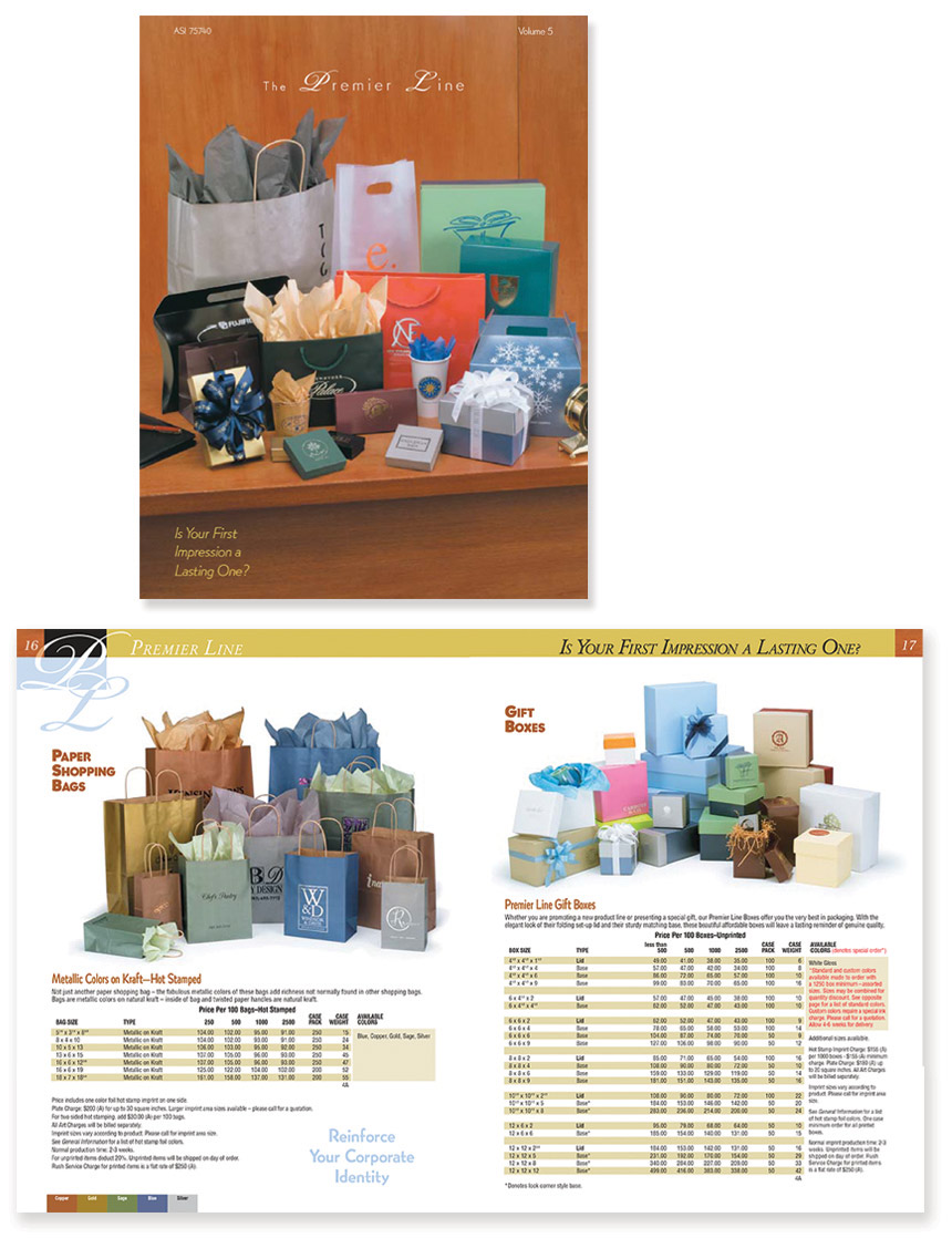
How do you sell bags at a premium? That's right. I said bags. And I mean shopping bags, not fancy handbags or totes. Well, here's a step-by-step example of how I helped a client do it. (Moreover, this is how I'd recommend that anyone do it.) First, I started with great photography, because you can't sell any "luxury item" without great photography. A brand like, say, Gucci wouldn't have gotten very far had they advertised with photocopied flyers. So I'm pretty sure these paper and plastic bags wouldn't have stood a chance without great photography. Next, I retouched every photo, painstakingly, one kilobyte of image area at a time. (In this case I used similar techniques as those traditionally reserved for retouching magazine models.) The trick was to make them crisp, clean and near flawless, but not so much that they looked plastic…er…I mean…fake. (Some of them actually were plastic.) After that, I created a design that was super clean, because expensive things look best in an uncluttered space. Notice that I even designed the cover such that the luxurious mahogany desk and background would display a uniform appearance; this allows all the products, the bags, boxes, and packaging accessories, to remain the star.
FEATURES: Branding, Branding, and more Branding
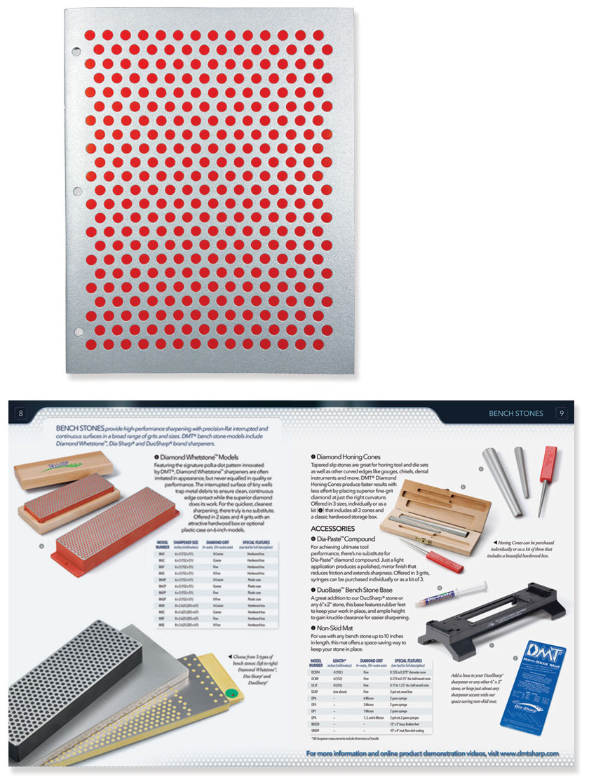
This client makes sharpeners that are essentially a surface of steel covered in industrial diamond crystals. The size of the crystals determined the coarseness of the grit. Their most noteworthy innovation, however, was this: a pattern of holes drilled in the surface such that the swarf (the metal dust or shavings removed from the edge during sharpening) can collect in the holes rather than build up on the sharpening surface. I mention this not to point out this nifty feature but for an entirely different reason: an accidental bonus of this feature. It resulted in an entire product line of very unique looking sharpeners with a very striking dot patterns on them, which stood out remarkably against the array of plain ol' boring sharpening stones. That was the only bit of inspiration I needed to come up with this catalog design. Here I selected a very high-end paper for the cover, one that would display flecks of brilliant flake that could mimic the diamond coated surface of the products. Then I illustrated that familiar pattern of dots in order to achieve a debossing effect that, when stamped in a colored (red) mat foil, looked just like a giant DMT diamond sharpener. (At each reprint we used a new color, blue, white, black, etc., to reflect the variety of product colors.) For the inside, I used a super bright white coated paper to display the page design and product images throughout. To further emphasize the brand, I "splashed" the dot pattern throughout, and designed a graphic to appear at the top of each page spread, which represented a sharpened bevel edge glinting in the light. Furthermore, I chose a primary font that had sharp crisp edges and a secondary font that had angular and pointed serifs. Every border, every curve, every contour was done in increments of single-pixels and hairlines to make the entire layout feel…well…sharp.
FEATURES: Soup-to-Nuts (and Fish) Design
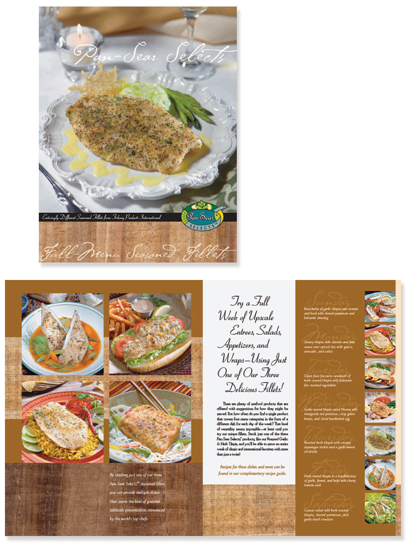
Here's a question: what is required to launch a new food product line? The answer: everything. When this client launched a new line of prepared fish, they essentially started a whole new industry. Unlike previous lines of frozen fish—which are usually battered, stuffed, or dusted with bread crumbs—this line was coated in upscale flavor profiles: Teriyaki Sesame, Lemon Pepper, and Roasted Garlic and Herb. Moreover, they could be baked, pan-fried or grilled, rather than just dropped in a deep fryer. So I had to figure out how we could position this product as a new way to think about prepared fish. I started with the idea that a cafeteria or banquet hall could conceivably put an entire menu together with this single line of fish, and they could do it overnight without lifting a finger! In essence, one would have a full menu the instant they placed their first order. That's what inspired the tagline, Full-Menu Seasoned Fillets. It was also when I set out to work up some recipe ideas, which I submitted to the company's house chef to test and refine. As he worked on that, I designed the logo. The concept I developed for the logo was a kind of hybrid idea that combined the friendliness of the Betty Crocker® logo with a modern Neo-Cubist twist that would speak to the originality of the product. (See a closeup of the logo here.) I selected my 7 favorite recipes to promote "a week of upscale dishes" so the concept would be fully supported and easily visualized by the prospective buyer.
FEATURES: Soup-to-Nuts (and Fish) Design, Part 2
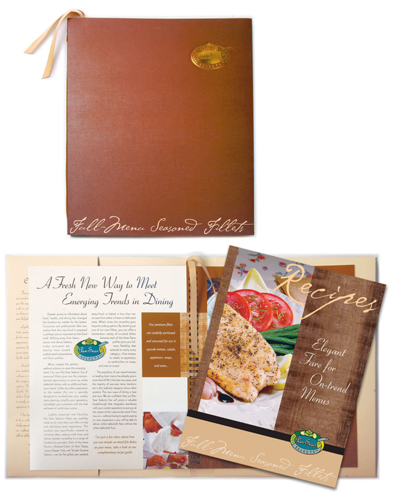
Now that I've shared the "soup-to-nuts" elements of my design in the previous sample, I'm inclined to share the second part: presentation. Having created all the parts, and furthermore having assembled them into a strong sales message, it was now time to create the right kind of presentation. For this I designed a brochure kit to include the aforementioned brochure, a recipe booklet with 10 recipes, and a few other goodies, then I wrapped them all in a bronze foil-embossed folder that was made to resemble a restaurant menu jacket, complete with a cloth ribbon tassel. I was honored to receive an award for this design (which was a nice surprise), but more importantly the presentation created quite a buzz in the industry and the program was a huge success. And that ain't no fish story; It's a fish FILLET story.
FEATURES: Design with Easy-to-Follow Product Demos
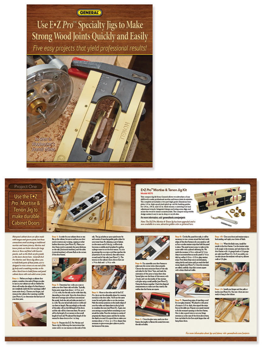
A lot of people think creative advertising and design is all about originality. Not me. I think the best concepts are those that strike a perfect balance between originality and the commonplace. What I mean by this is that a commercial artist should use his or her creativity to develop new variations on the most expected of things. The audience arrives at every design, every TV spot, every web ad, with a set of everyday expectations. As an extreme example, consider this: in the course of reading this paragraph you (seamlessly) started at the top left and continued left-to-right until you finished bottom-right. This is the convention, the standard, and therefore a designer would never design a page to be read from bottom-right to top-left. Such a design decision, though "creative", would result in layout that was too cumbersome, frustrating and…well…ridiculous. This same sort of principle should hold true for the organization of all the visual elements in a design; one should always arrange them in expected ways so that the consumer will have the most effortless (seamless) experience. In this sample you will notice how I honor my viewer's experience by delivering information in what I believe to be an expected manner. Each spread contains one project and one step-by-step project demo. In the upper-left corner I placed a graphic with the words "Project One", with subsequent page spreads beginning likewise (Project Two, Project Three, etc.) Also in the image area at the top, I placed (left to right) the project title within a box, then a still-life image of the project at hand, followed by the product description box, complete with a product and accessories photo. The lower portion of each spread is reserved for the project itself, with step-by-step instructions and photos. Every page spread throughout the booklet is presented exactly in that manner. This sort of orderly arrangement is what people expect, so that's what I give them.
FEATURES: Hardworking Layout, Copy and Graphics
Sometimes a brochure design has to work hard, real hard. This is especially the case with the Trade Show Exhibitor Prospectus. After all, it has to convince its audience that the huge financial and time investment associated with the event will ultimately prove fruitful for the company. As a designer, sometimes you have to pull out all the stops; you have to dig though all the tried-n-true techniques, all the classics that some "creative types" might consider tired and worn out. I use them all, and I use them because they work…a few work more than others, of course, but when done correctly, they're all worthy of some small space on the page. In fact, small space is the key; one has to keep everything short, concise, and isolated so the whole thing feels easy to read. A quick glance should be all one needs to grasp the "Letter from the CEO", the "Elevator Pitch", the "Top 5 Reasons" list, and, of course, the "Slap-you-in-the-face Infographics" for those visually oriented readers.
FEATURES: Sturdy Design for the Financial Industry
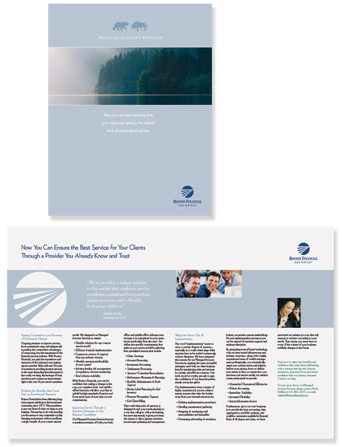
For a short time in the early years, I worked in an ad agency that specialized in bank advertising. Every client was a bank, and nearly every account involved a complete overhaul of the bank's marketing materials, from mortgage loan brochures to checking account kits, from in-house signage to floor displays, everything. If it had words on it, we designed it. We even did those ugly legal posters that you find plastered around the lobby. It was a strange time in my career because I learned just how conservative the banking industry was (and had to be) in order to encourage the trust and confidence of the banking public. (And this was BEFORE the Subprime Mortgage Crisis!) Today, I still maintain a set of "design tools and rules" that I reserve strictly for financial clients so that my designs will hold firmly and steadily to the notions of trust and stability. Here’s just one recent example, which demonstrates the crisp and conservative design style that is generally favored by banks and financial firms.

