FEATURES: Composite Artwork for a Delivery Truck
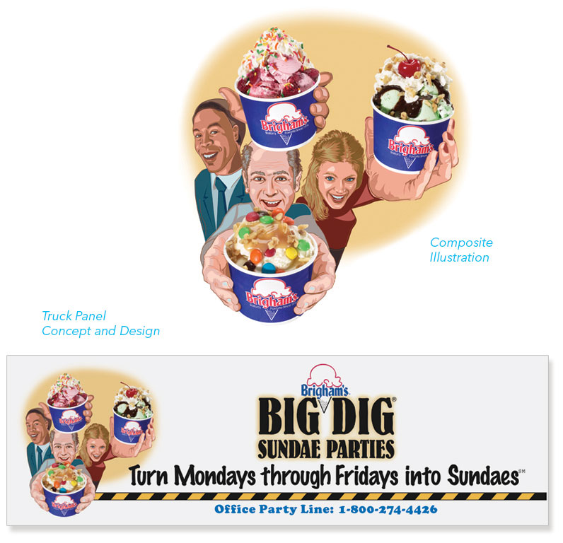
Outdoor advertising has its own set of problems to solve. At the top of the list, it's important to make it read fast…nearly at a glance. This ad was made to promote ice cream parties at work. Therefore, logic would dictate that I should show the ice cream, state the message, and bang, I'm done. However, there was a snag. Here I didn't want to settle for a boring "still life" of ice cream, but I also didn't want to overemphasize "the party" aspect because the models would totally dominate the image and overshadow the ice cream. I couldn't do that. After all, it's all about the ice cream. (Mental note: possible title for my autobiography.) So my solution was to take several unique photos of delicious ice cream sundaes, and then composite them over an illustration of people, which I illustrated in forced perspective to complete the effect. In this way, I was able to show "happy party people" while the ice cream would maintain its rightful position, front and center stage. I've included the full layout of the truck panel, including the tagline. You can see how the ice cream appears to pop out in front of the graphics.
FEATURES: Informative Technical Illustration Used to Educate Consumers about Complex Software Products
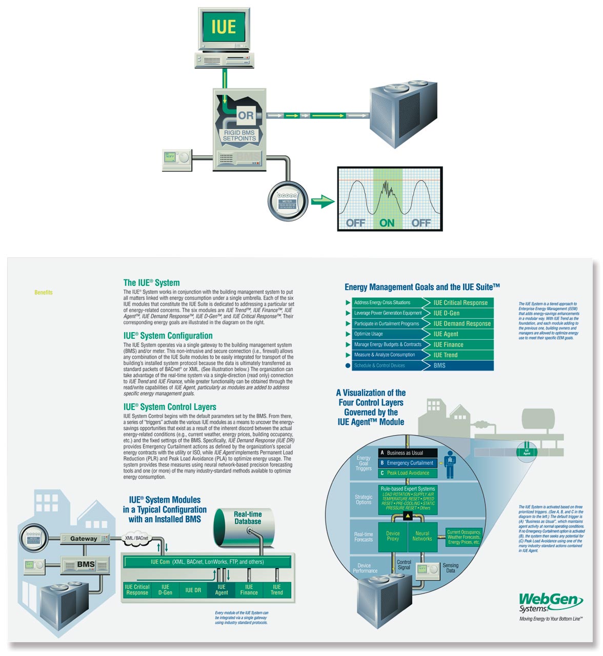
In some areas of business there are stories that must be told that aren't so easily understood without the aid of graphics. This is especially the case in the business of Artificial Intelligence Software. This client developed a program that minimized energy consumption in large buildings by monitoring realtime external data, such as up-to-the-minute weather forecasts and energy prices. Using Artificial Intelligence, their system was able to compute this sort of data and then make small adjustments to the building's energy systems. It could close off doors, open vents and redirect power only to those areas where it was needed most. By doing so, the building would use less energy (and consume it more during drops in energy cost) all the while anticipating upcoming weather conditions to eke out further savings. This sounds great in theory. However, whenever anyone attempted to explain it to a building supervisor, that person would be met with odd looks, rolling eyeballs, and perhaps an occasional snicker. Let's face it. We've all seen The Terminator, so we all know what happens when we allow the machines to take control. Who could blame them for their trepidation. To overcome this obstacle, my recommendations to the company were comprehensive (and too detailed to explain here), but I will summarize by saying this. Part of my solution involved a set of very well-conceived and straightforward illustrations designed to take the fear out of the sale. See the related WebGen trade show booth design on the Displays & Posters page.
FEATURES: Clean and Consistent Design and Iconography for Sales Presentations
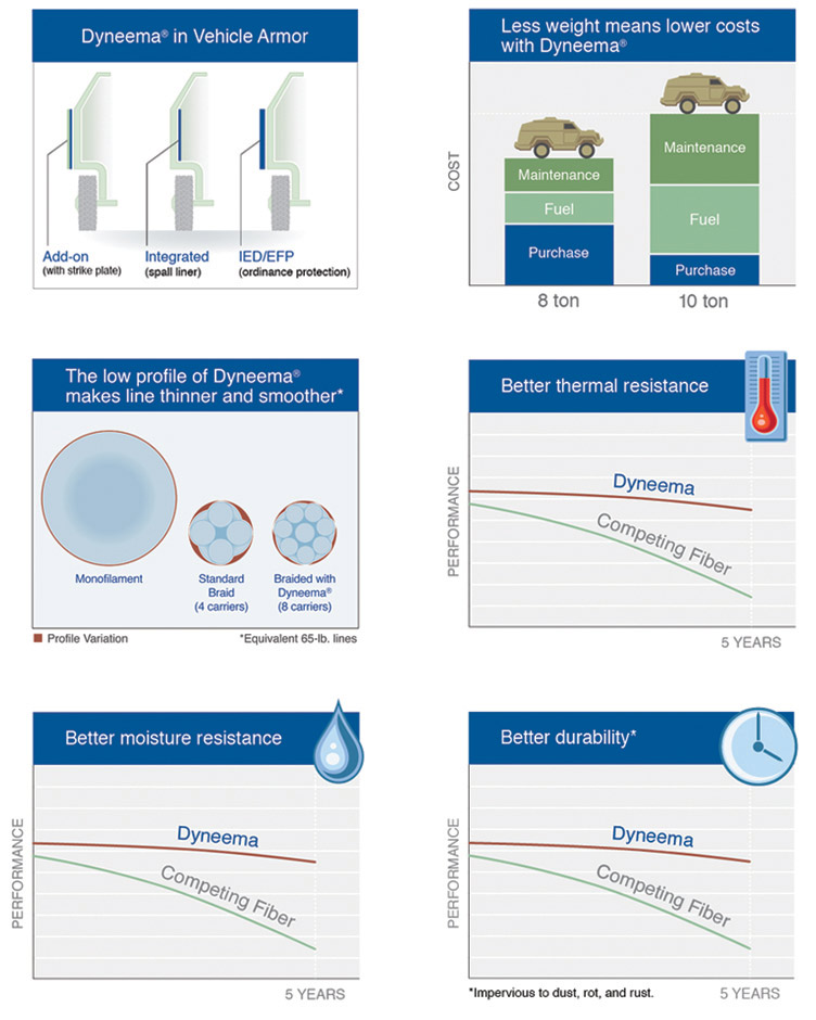
Here's a tip for internal marketing groups and young designers: if ever a manager or client asks for a single slide layout, no matter how simple, be sure to provide a full complement of specifications and elements for future slides. This should include guidelines for primary and secondary fonts; primary, secondary and tertiary colors; and a template. It can also include a description of the drawing style, though that style might already be evident in the one-off slide design. I make sure to do this every time for one reason; invariably there will be a second slide request down the road, and another, and another after that. By creating guidelines from the beginning, the sales team can essentially commit to the given style choices you make from the start, thereby eliminating the hodgepodge appearance of a typical sales presentation created over time through a series of last-minute "quick and easy" requests. To those who have never worked in support of a sales force, perhaps this advice sounds unnecessary. But for those that have...you know what I'm talking about. If you want to be effective, and proud of your sales presentations, you've got to do the legwork above and beyond what the individual salesperson finds necessary.
FEATURES: 3D Modeling and Lighting Techniques
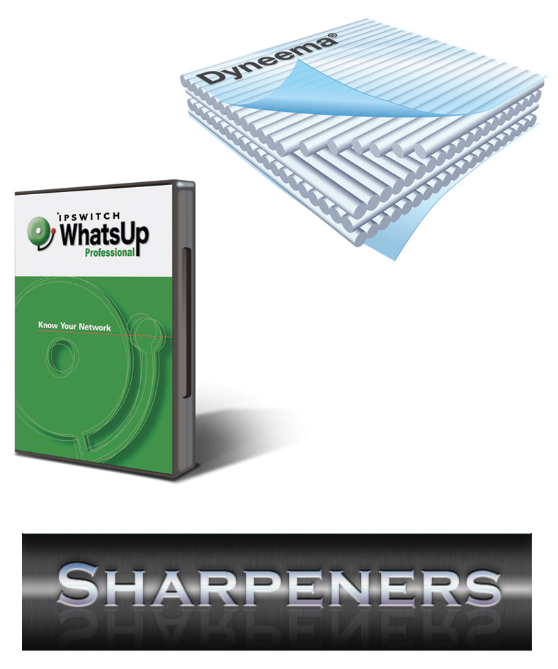
On a timeline, my professional career lines up almost perfectly with the growth of the industry giant, Adobe Systems, Inc. So, as you might imagine, with the introduction of each new Adobe product, and with the release of each new product version thereafter, I was always there, ready and willing, to try it out. Having experienced my journey alongside this corporate giant as it delivered its ever-changing line of amazing tools, I (along with my countless industry fellows) had the distinct pleasure of learning new tricks and techniques just as each new tool entered the marketplace. (Interesting side note to young designers: the first few releases of Photoshop had no Layers, so the word "paste" actually meant paste. Permanently!) Anyway, here are a few of the successful "trials" I created along the way: A trompe l'oeil software box (far left) from the year Adobe Illustrator first featured complex blending algorithms; a layered translucent fabric image from the year Adobe Illustrator offered 3D modeling tools; and finally, a reflective title graphic that shows some rendering tricks made possible by an early release of Photoshop Blending Options. Yep, the tools may change but the fun never stops.
FEATURES: Logo Design Unified by Shape and Distinguished by Style
These logos were designed for a company that makes frozen seafood for restaurants, banquet halls, and cafeterias. Each represents a line of prepared fish that allows food service to be completed in large quantities at economical prices. The logo on the left was designed to promote an innovative brand that features exotic flavor profiles and unprecedented versatility of preparation (baking, frying, or grilling). As such, I wanted to combine the user-friendly feel of the Betty Crocker® logo with a modern Neo Cubist twist. In a literal way, I combined the images of a fish and pan, and topped it with a bouquet garni. The sharp, crisp lines were necessary to fortify the modern vibe. The second line of prepared fish was completely different; it was developed to mimic the traditional ale-battered, golden-fried fish found at historic ale houses in Great Britain and New England. For this brand, I proposed the name Ale House Gold to play on its value. For the graphics, I sought to create a sense that the logo had been around since the 1800's, as if it had been copied from an old sign that once hung from an iron cantilever outside a little pub in London or Dublin. I chose the image of a cod clanking frothy mugs with his mate, and placed them amidst seaweed, shells, and a nautical-themed family crest. (I'm pretty sure the result is one of a kind.) To view samples that utilize the Pan-Sear Logo, go to Catalogs & Brochures page; and for Ale House Gold samples, go to the Art Direction & Layout page.
FEATURES: Logo Design that Employs the Infamous Bane of All Logo Design: the Swoosh
There's a running joke, more like ongoing mockery, connected to any appearance of the "swoosh" in logo design. It started some time at the beginning of the internet boom in the 90's. This was a time when small technology startups were a daily occurrence, and each one that popped up needed a new logo to brand it. Sounds like a logo designer's paradise, however too often these designers were limited by the conservative-minded engineers, programmers, and scientists that would give the final OK. As a rule, what resulted was a lot of tech names with swooshes woven arbitrarily within and around the text. Of course, there are exceptions to every rule, and I like to think these two fall into that category. In the first example, two "swooshes" mimic the shape of a "B" within a box that appears to be pixelated. This forms the logo bug, which could be used by itself, or paired with the company name, to represent the flow of bits. The inspiration for this logo came from the fact that the company, BitFlow, made imaging boards that processed analog and digital data; the "binary swoosh" represents dual analog signals while the tiny squares, of course, represent a bitmap, a digital image. A single stray bit is also employed to dot the "i" just for visual interest. The second example is a "dot-com" logo made for a placement agency that exclusively served the scientific industry. The idea here was to create a cyclic graphic using the dots inherent in the name. This naturally depicts the course of employment, the opening and fulfilling job posts, while it also mimics common scientific graphics, such as planetary or molecular orbits. The "O" in the word, "One", was manipulated, enlarged and centered, to balance the graphic and further emphasize the circular design.
FEATURES: Logo Design for Kids and Families
As a father of three, I've experienced the pleasures (and pains) associated with modern American family life. Most people in the 30-plus age range are very well aware of what I'm talking about. Things are very different from the days of our youth; there's much more stuff out there for kids and families to do. There are more sports to play, more entertainment venues, more games, equipment, toys, and gyms in which to jump, climb, flip, bounce, dance and fly. There are animatronic dinosaur shows, wilderness and zip-lining adventures, pottery painting shops, and don't forget all those theme parks. You get the idea; if you can imagine any sort of unique family activity, then there's probably some place already out there offering it. Now more than ever, a designer needs to have a good understanding of the concepts that are most important to families, things like cooperativeness, inclusiveness, age-appropriateness, cleanliness, safety and, of course, fun. These are the sorts of ideals that must always be considered when designing for the Kids and Families Market.

