How many times have you heard that question? As an artist and designer for more than 25 years, I’ve heard it plenty, and I should think you have had enough of this old debate too. Then again, maybe you’ve chosen to read this post because, like me, you never managed to come across a satisfactory answer. My hope is that this one will do the trick. If not, I invite any and all comments and questions that might offer better insights to help young designers seeking advice on this subject.
Let me start by saying that, in many ways, the question itself is flawed. What does it mean to “know how to draw”? In one sense, it might be said that a toddler “knows how to draw” if she can make a stick figure appear within a crooked pentagonal outline, right? After all, her results effectively communicate the idea of a person with a house. Conversely, it might also be concluded that a 30-year veteran graphic designer “does NOT know how to draw” for the reason that she too often calls upon illustrators to make her FPO (For Position Only) sketches, because she lacks the confidence in her own drawing ability to do them herself. So, while her design ideas may be consistently top notch, she would require a colleague to draw, say, a person in front of a house, before she can present them to the client.
Now suppose the toddler and graphic designer were the same person. Realistically, one could argue that the designer could have simply redrawn the very same stick figure and crooked pentagon she drew in her childhood, and then submit her mock-ups to the client with no loss of communication or understanding about her designs. In fact, one might even argue that the childish drawing offers a better means of communication because the client could never mistake such a rough image for the proposed final version, as too often we find in cases where FPO images are obtained from stock photography or overly fastidious illustrators. (It happens, and I have first hand experience to prove it. I’ve had a client insist upon using my FPO illustration INSTEAD of the proposed photography, and the unfortunate result was, in my view, a dated-looking and conceptually suspect design, which was clearly NOT my vision for the ad.)
While I understand that my hypothetical examples come with the unfortunate side effect of raising too many questions (and opinions) about degrees of drawing ability…and presentation standards…and design professionalism…and blah, blah, blah; I ask that you reserve those details for the moment. For right now, I only ask that we consider it as support for my initial point. The practice of drawing is not something we can easily define with criteria, so we have to begin this discussion with the mutual understanding that the original question needs further clarification before a satisfactory answer can be attempted. For the purposes of clarification, I propose the following two-part question as an alternative.
Should Graphic Designers know certain principles of drawing that might prove advantageous to advance their Graphic Design career? And if so, what among those principles will be most beneficial to practice and maintain?
The answer to the first part is easy and definitive. Yes! There are certain principles, certain skills, that can be described as crossovers between Graphic Design and Illustration. Graphic Designers should understand and practice them just as illustrators do. (I will outline those necessary skills in the paragraphs below.) Once you’ve developed these skills to a professional level (and made a commitment to maintain them), the subject and nature of your drawings are up to you. Having obtained these skills, if you should then elect to present mock-ups of a simple nature and style, using pentagons and stick figures, then good for you. Such a choice of visual communication is truly between you and your client. Alternatively, if you’re not self-employed and your employer maintains much more rigid standards for client presentation, then chances are they already have plenty of talent in place to execute more sophisticated renderings when required. Either way, you can remain confident in your skill set, and moreover, certain that your ideas will always be communicated up the ladder with clarity.
Before I describe the drawing principles that I find most beneficial for Graphic Designers to master, I have one last point of emphasis to share, which may prove helpful for keeping the discussion on track. For this purpose, a short snippet of my drawing background will be necessary.
I started drawing regularly when I was very young, maybe 5 or 6 years old. My practice was likely fueled by my propensity to be alone (and maybe too sedentary) as I traversed those awkward pre-pubescent years. One could say that I was quiet, low-key, and self-conscious, so my preference was to hide myself away and draw. Whatever my reasons, that’s what I did. I drew…a lot. I drew everything. I drew everywhere. Whenever and wherever I could put my head down in my private paper wonderland, I felt content. This feeling of contentment carried throughout college and across my career, and I’ve never lost my zeal for the art form. Now here’s the point: given all those hours of drawing, and all the drawings I drew over the years, I have yet to find much use for drawing in course of creating a graphic design. Having said that, it certainly would be reasonable for one to contend, “if YOU find little use for drawing in graphic design, then what could possibly be useful for ME to learn from the practice of drawing?” This question, this notion of skepticism, is exactly what had inspired me to rewrite the question in the first place, because this discussion should never be about the act or capability of drawing; it is only a question of the fundamental principles that are mutual to both Graphic Design and draftsmanship.
Here are the principles that every Graphic Designer should know and practice: Proportion, Contiguity, and Chiaroscuro. (NOTE: a follow-up to this blog will address the subject of Chiaroscuro in Graphic Design in greater depth, and will cover some of the common filters used by graphic designers in PhotoShop.)
Proportion, the comparative relation between the elements of a whole, is very critical to drawing. That much we all know. Whether it concerns the demand for believable relationships in a realistic rendering (such as the accurate proportioning of the human head on the human body); or otherwise the choice to exaggerate proportions for the purpose of emphasizing abstract concepts (such as we find in comics and animated films whose characters have intentionally oversized heads on small bodies); proportion is a regular and necessary consideration in the act of drawing. In fact, this is a principle that pervades and permeates every part of every drawing, and likewise, it’s entangled within every page design. What I have stated here is not some kind of revelation; every designer knows that considerations of proportion are part of every design, if not just for the purpose of sizing a font to fit a headline. However, the proportioning within a design should go much further than that; it should be considered throughout the page. Unlike in drawing, where every element set down by the draftsperson is under the microscope and open to continual scrutiny (e.g., the foot in front looks smaller than the foot in back, the chair is too big to fit under the desk, etc.); in page layouts there is not nearly the same degree of examination or criticism. As a result, graphic designers, complacent with the idea that “nobody will appreciate the difference anyway”, tend to relax their standards, churning out layouts that show only the minimum of considerations for proportion. By adopting a regular practice to include exercises in proportion, a designer can not only minimize the potential to produce such lax designs but furthermore improve and maintain a higher level of excellence in page design.
Contiguity, which is the state of things that are connected, close in proximity or continuous in appearance, has proven to be an elusive subject in the area of graphic design, and perhaps also in many schools of drawing. Few artists seem to talk about it, much less emphasize it as an important principle of both graphic design and illustration. My guess is that its absence from the discussion has largely to do with the subject’s difficulty to pin down. After all, how are we to interpret the significance of things that relate in terms of proximity or continuous arrangement? What can we gain from (or loose by) representing contiguity on a page? Should we view such arrangements as beneficial or injurious to good page design? I’m not going to attempt to answer these questions here; this is an encompassing topic best reserved for another day (maybe a future blog topic). For now, it is enough to say that Contiguity is something that has to be identified and addressed on a case-by-case basis; sometimes it hinders the legibility of a page and other times it helps to highlight important features within a layout. The overarching thing to remember is this: designers that make a conscious effort to keep contiguity as a priority of design are the same who will produce the most effective results because they are the ones who can best manipulate the viewers eye in a purposeful manner.
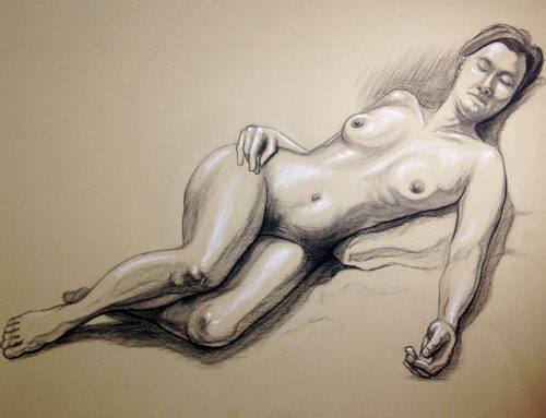
Chiaroscuro, for those unfamiliar with this word, is an Italian Renaissance term that refers to the pattern of light and shade on a two dimensional surface. (We don’t have an equivalent word in English.) It alludes not only to the way light and dark colors are arranged to represent the individual forms on the page but also the pattern of lightness and darkness across the entire surface. During the renaissance, chiaroscuro was an important concept because it was integral to the artists ability to create realism. And more importantly, it was critical to page design. In fact, oftentimes an artist would nearly ignore the form of certain figures on the page, leaving them completely white or nearly blackened in silhouette for no reason but to preserve the page design above and beyond any concern for realistic representation. See it for yourself. Take a minute to Google a few Rembrandt Etchings. In particular, spend some time with The Hundred Guilder Print (Christ Healing the Sick), The Stoning of St. Stephen (the etching or painting), Christ and the Woman of Samaria Among Ruins, and The Triumph of Mordecai. Squint your eyes and see how the artist arranges his page in large collections of light and dark. That is chiaroscuro. And that is how the old masters manipulated the viewer to gaze upon exactly what the artist wished to make most visible. In modern terms of graphic design, those desired visual targets are logos, headlines, and special product features.
Having listed these three principles offers help to the aspiring graphic designer only insofar as it provides a reasonable area of focus, a set of ideas and techniques on which to concentrate. The question remains: how should I practice these principles? What steps should I take? What supplies will I need? What exercises should I do?
The answer to these questions will vary based on the artist, but I’ll no less offer my own suggestions to get started. In my view, each designer should keep it simple. Grab a sketchbook and a pencil, a tablet and stylus, graph paper and pen, yellow pad and mechanical pencil, or any combination of drawing tools you prefer, and start doodling. Find places where you can relax without distraction, like a park bench, a coffee shop, or any comfortable hangout, and sketch. You don’t have to draw realistically; you can draw basic shapes (such as square for a chair back, an oval for a tabletop, a rectangle for the window).
Play with these sorts of simple arrangements. Change the proportions and the tonal values. Sweep your line through the drawing looking for contiguity between objects. Shade the objects with broad patches of light and dark. Squint your eyes often to block out the detail, and focus mainly on the large, basic patterns, the chiaroscuro. Make little thumbnails of these scenes, creating slight differences between each one. Pick your favorites, and save those to inspire layout ideas for the future. Return to your sketchbook time and again to reexamine your drawings, and, most importantly, look at them with a fresh eye to identify the proportions and chiaroscuro, and especially instances where contiguity shows influence on the movement of your gaze.
If you’d like to develop your drawing skills further, look for free tutorials online, but make sure to stay clear of those videos that focus too much on detail and rendering techniques. Eventually, if your fundamentals develop to a point that inspires higher degrees of representation, then go for it. Try drawing a group of figures sitting in a bright cafe or hall, with dynamic shadows cast on the floor and walls. Seek out scenes that have many objects and planes, but always remember to keep focus on the most important features of page design: the proportions, the lines of contiguity, and the large, simple patches of light and dark. If your rendering skills don’t seem to develop as fast as you’d like, that’s OK too. Because, with or without a dexterous hand for representation, you are no less continually practicing the three main principles you need for great graphic design. With this you will build confidence and feel completely self-assured about your skills as a designer. Best of all, you’ll never have to wonder again if you should “know how to draw”, because you’ll stand confident knowing you have the right kind of drawing skills to become an award-winning graphic designer.


